


AltME groups: search
Help · search scripts · search articles · search mailing listresults summary
| world | hits |
| r4wp | 0 |
| r3wp | 15 |
| total: | 15 |
results window for this page: [start: 1 end: 15]
world-name: r3wp
| Group: Core ... Discuss core issues [web-public] | ||
| RobertS: 1-Apr-2008 |
Diss'ing IDE's might alienate some Smalltalk folk. I cannot imagine
maintaining an application suite such as I deal with everyday without
an IDE. I just wish it was not eclipse ... Of course only wimps
used a Disk Operating System and real men code in machine codes only
... and real pro's dictated their SNOBOL punch cards to lovely assistants
... and ANT scripts are for sissies. Some must have ridiculed Tcl,
Expect and TK in their day ... but if my IDE can facilitate my efforts
to systematically (key word there) shrirnk company''s codebase as
it becomes more reliable with better test coverage then maybe a refactoring
browser would be a good tool after all. Even better if it is an
integrated part of the IDE, as in Dolphin Smalltalk or Squeak Smalltalk
or Smalltalk/X or Cincom Visual Smalltalk. Not that I couldn't survive
on grep and diff's. But once the codebase is too large for any one
person to author or maintain on their lonesome, a tool that remebers
what you did last and where can be a god-send. If you want to know
hell without an IDE join an actuarial department working in APL.
There you don't even know if they have talent: you just hope most
of it works as each quarter rolls around and try to survive year-end.
But you know they're smart, cuz after all, they're actuaries - and
look at all that APL code in all those files ... of course a few
of them look back wistfully at their student days in C with Borland's
decent IDE. REBOL [
File: %vid-usage.r
Date: 09-Jan-2004
Title: "VID Usage"
Purpose: "VID Usage Tutorial with Runnable Examples"
Version: 1.2.1
Author: "Cybarite"
Edits: RobertS
Source: {
Based on %easy-vid.r by Carl Sassenrath.
Clips from various sites including email that are attributed in the
section
}
library: [
level: 'intermediate
platform: 'all
type: [tutorial]
domain: [gui]
tested-under: [view 1.2.8.3.1 on W2K]
support: none
license: none
see-also: none
]
]
flash "Fetching image..."
read-thru/to http://www.rebol.com/view/demos/palms.jpg%palms.jpg
read-thru/to http://www.rebol.com/graphics/reb-logo.gif%rebo-logo.gif
read-thru/to http://www.rebol.com/view/bay.jpg%bay.jpg
pic: %palms.jpg
unview
customer: make object! [ ; this sets a default customer object in
case the user does not push the samples in order
name: "Rosetta Stone"
date-of-birth: 14-March-1959
]
stylize/master [text-note: txt maroon bold] ; this sets a
default for users who run the samples out of order
; polished is an image that is embedded in this script file
; so that no outside files need to be loaded.
; This technique is used in many of the REBOL samples
polished: load #{
89504E470D0A1A0A0000000D49484452000000670000003808020000006FFB71
8C0000001374455874536F667477617265005245424F4C2F566965778FD91678
0000039B49444154789CCD9BD14E2B310C44F3FFFF521E2AC1C395E00589EF02
5DD8D226713C339EECBD928510A4893D3EF67AB76D7B7E79FEB2D73FAFBDBD1D
36FEEBAF7DBF70FEDABABD0D56F0E1B6E0B6FED7AE81050B2E4F97AF9FED6185
45022048CA2C6920361F1336580B35A63C4E4F12808D378124CE9C81880B186C
14175A1DE9C0C2A2E785B6B64CA62EF6C626330250A932064CB984F3358FA77F
BC7F8CD657685E5FB03415A34B9E3226C1484A1ACA6DB6974597699EFB6C2F4E
C44B92E17454A309F14F348DDD4D5B98195BB2AF6B7E4E545B57FEBAE0415DA0
43EFE62C70B196362285D74C35F0782ECF26A0FC8492E20EAAED6CC35ACE13FC
61646467C69D5715EA4F9D3725B1703BF45AB2768A9D5F59CA6E716E5A747CBF
23D6A7E418C2C53C6EB440FCE803B106E6D94C8AAF4B42694871B9FB237035C8
70E5A0200D4A7E4553E952A6F435BA247DD4B83A5DB18D26AA4D5E39E0CA4107
7B0F86C7F19EC685B5EFE57D28E02E411CC2238C0304B5065D26DCC1DA9A02FC
CE4EBD19A0C58D9BE039179086B6DB20519A1F5C8194071DBB115703B996FF37
4BE0F5AA269B18CFC9C6CC1FC3D5A0D6B62C6AEA112236F38195B88DF12F9C9B
B45B1C6C637B161E1D5BCF6D8807A0437366CB21D90462F2BD3E827C96CB0483
D67B99916407E99E69FD12F46A50C973856268A5DC345259837D8827E00FF890
452D0B5D0D38932F3C65B9614B4F720901B96565DCCBD7236B7C66B650868D08
9BFA26EBB36DCAA5E3B120339E5EBE3B468E6B68FB3041E79229047367ADDC14
F7B376F26B2722024A41998813A04CB91A475C11C9054536473CA3F7365C0D30
9E65A0BA6D5977CFEE030BD626B9E2E5DFE76E51AFF9CADA6308F899C76E756A
03D4796E80532E986D273B71CEA8D81672739E0F1B329F8E999D0D9D04080769
CABC1D21260C2BB8E43D2A9D70BE3A2207D66EA09E5BCAFFB742F9F0A0C37677
222CFE9B7C2865192B3FAC5988E0385747334BD8288041E0DFBF4F2AD44804B4
6DADAF2BE98C5D02458059B3571CA91481B09580A9D6E827B184DD3756D6BF7E
7376F81ED59E46633384296A9A4BA7D4E3B8CBD3E566F1948B754731E0EBC41B
246774BD7BBBCA612D8CA7CC85A7C1ED093B75721DCED1D7E279871668830AE7
B782F5E9FDE4918360C9F666A6F61647F2EDB342A2FA3F6E9B0C8AC2699B9B3F
53847BB992B5707FDE5B6D721EA3EB55E3D8190D8BD998923A68917BE3FEDD32
EE1BDCA216275C1CCFBD0A07F35A40A6CC05A1357E6BF512D26DC470BAC927A3
B0078A42DD22E10000000049454E44AE426082
}
content: {VID Usage - REBOL Visual Interfaces
===Updates
--01-Apr-2008
* Fixed oddity with last item on stylesheets which was locking up
some versions of VIEW
---09-Jan-2004
* Fixed slider initialize.
* Focus section was not parsed out. --- fixed
* Fixed some text errors for the parsing of ===
---07-Jan-2004
* Revived vid-usage.r
* added more examples from the script library
* manage source as vid-usage.leo an outliner file
---12-August-2001
Added supply examples. See:
!List/Supply
!List With Supplied Data
!Supply List With Scroll
---13-August-2001
!Add Subpanel example ported by Anton
===Caveats
---Work In Progress
This is a work in progress. Whether the progress will continue depends
on the feedback.
---All Rights Reserved
The work is based on the documentation of REBOL View provided by
REBOL Technology and its mailing list.
All rights to this documentation remain the property of REBOL Technology.
---Plagiarized Examples
Things are shamelessly plagiarized. There are many experts on the
mailing list whose work is included here; most notably the examples
from the REBOL documentation.
---Approach
The approach that this document uses is to use REBOL/View/VID to
demonstrate its abilities and give a visual tutorial. To enable this
some changes have been made to the core %easyvid.r program from Carl
Sassenrath. A scoll bar was added to the right pane because it was
just too difficult to constrain the examples to the screen real estate
that was available.
---Order Order
The order of the items needs some work. The easyvid presentation
approach today does not allow for the drilling down and expansion
of an outline tree which is needed for a large amount of documentation.
The preferred approach is to put a multi-level tree for navigation
purposes and then allow navigation up and down the tree.
===To Do
* make this a true outline tree
* re-organize it better
* update as requested and as possible by suggestions on AltME's REBOL
world under group EasyVID
* correct numerous flaws
* better scrolling implementation using the updates that have been
used in other examples such as Didier's %delete-email.r
* allow clipping to clipboard like AltME does on a row for the source
examples
===Introduction to VID
With REBOL/View it's easy and quick to create your own user
interfaces. The purpose of this tutorial is to teach you the
basic concepts or REBOL/View interfaces in about 20 minutes.
VID is REBOL's Visual Interface Dialect. A dialect is an
extension of the REBOL language that makes it easier to express
or describe information, actions, or interfaces. VID is a
dialect that provides a powerful method of describing user
interfaces.
VID is simple to learn and provides a smooth learning curve from
basic user interfaces to sophisticated distributed computing
applications.
---Creating VID Interfaces
VID interfaces are written in plain text. You can use any text
editor to create and edit your VID script. Save your script
as a text file, and run it with REBOL/View.
!Note: Using a word processor like Word or Wordpad is not
recommended because files are not normally saved as text.
If you use a word processor, be sure to save the output
file as text, not as a document (.doc) file.
Recommendation: Look at TextPad from http://www.textpad.com
===Minimal VID Example
Here is a minimal VID example. It creates a window that
displays a short text message. Only one line of code
is required:
view layout [text "Hello REBOL World!"]
You can type this line at the REBOL console prompt, or save
it in a text file and run it with REBOL. If you save it
as a file, the script will also need a REBOL header. The
header tells REBOL that the file contains a script. Here
is an example of the script file with a header:
REBOL [Title: "Example VID Script"]
view layout [text "VID Example!"]
You can also add buttons and other gadgets to the script. The
example below displays a text, list of files, and a button:
view layout [
h2 "File List:"
text-list data read %.
button "Great!"
]
!Click on the examples above to see how they will appear on your
screen. Click on their close box to remove them. All of the
examples that follow can be viewed this way.
===Window Management
The code that displays the examples also shows how to manage the
number of windows that are open.
Look at the show-example block in the code near the end of this script.
The location of the example window is also managed here by keeping
track of the co-ordinates for the sample. After the sample window
is moved, the next use will open at the same location.
===Pre-loaded Images
For this script, the image which represented a Portable Network Graphic
definition of an image is held in the script and loaded.
For a small number of graphics, this can achieve some packaging and
performance benefits.
The image "polished" is used through the script to achieve the polished
steel
look that is one the outer frame.
backtile polished orange
button 200x50 "Polished Steel Look" polished
===Two Basic Functions
Two functions are used to create graphical user interfaces
in REBOL: VIEW and LAYOUT.
The LAYOUT function creates a set of graphical objects. These
objects are called faces. You describe faces with words and
values that are put into a block and passed to the LAYOUT function.
The VIEW function displays faces that were previously created by
LAYOUT. The example below shows how the result of
the LAYOUT function is passed to the VIEW function, and the
interface is displayed.
view layout [
text "Layout passes its result to View for display."
button "Ok"
]
Click on the above example to view it.
!Note: the block provided to a layout is not normal REBOL code,
it is a dialect of REBOL. Using a dialect makes it much easier
to express user interfaces.
===Styles
Styles describe faces. The examples above use the text and
button styles to specify a text line and a button. REBOL has
40 predefined face styles. You can also create your own custom
styles. Here are a few example styles:
view layout [
h1 "Style Examples"
box brick 240x2
vtext bold "There are 40 styles built into REBOL."
button "Great"
toggle "Press" "Down"
rotary "Click" "Several" "Times"
choice "Choose" "Multiple" "Items"
text-list 120x80 "this is" "a list" "of text"
across
check
radio radio
led
arrow
below
field "Text Entry"
]
The words like backdrop, banner, box, text, and button are styles.
===Facets
Facets let you modify a style. For instance, you can change the
color, size, text, font, image, edge, background, special
effects, and many other facets of a style.
Facets follow the style name. Here is an example that shows
how you modify the text style to be bold and navy blue:
view layout [txt bold navy "Facets are easy to use."]
The words bold and navy are not styles. They are facets that
modify a style. Facets can appear in any order so you don't
have to remember which goes first. For example, the line
above could be written as:
view layout [txt "Facets are easy to use." navy bold]
Many facets that can be specified. Here is an example that
creates bold red text centered in a black box.
view layout [txt 300 bold red black center "Red Text"]
You can create facets that produce special effects, such
as a gradient colored backdrop behind the text:
view layout [
vtext bold "Wild Thing" effect [gradient 200.0.0 0.0.200]
]
===Custom Styles
Custom styles are shortcuts that save time. When you define a
custom style, the facets you need go into the new style. This
reduces what you need to specify each time you use the style,
and it allows you to modify the look of your interface by
changing the style definitions.
For example, here is a layout that defines a style for red
buttons. The style word defines the new style, followed by
the old style name and its facets.
view layout [
style red-btn button red
text "Testing red button style:"
red-btn "Test"
red-btn "Red"
]
So, if you wanted to create a text style for big, bold,
underlined, yellow, typewriter text:
view layout [
style yell tt 220 bold underline yellow font-size 16
yell "Hello"
yell "This is big old text."
yell "Goodbye"
]
===Master Stylesheet
REBOL holds its styles in a master stylesheet. When you are
sure that you want to share them without having to add the
style sheet line then do it as follows:
First add the style to the master sheet:
button 200x50 "Define text-note as maroon bold text" [stylize/master
[
text-note: txt maroon bold
]]
button 200x50 "Define text-note as white italic text" [stylize/master
[
text-note: txt white italic
]]
Then invoke it:
view layout [
across
size 200x200
return text-note "This shows a master stylesheet style in use."
return text-note "This shows another usage of the same style."
return text-note "If you want to see the other style displayed, click
the Add Style section again and then use the other button"
]
===Note About Examples
!From this point forward, all examples will assume that
the view and layout functions are provided. Only the layout
block contents will be shown. To use these examples in your
scripts, you will need to put them in a layout block, as was
shown earlier.
For example, code that is written as:
view layout [button red "Test it"]
will now appear as:
button red "Test it"
===Face Sizes
The size of a face depends on its style. Most styles, such as
buttons, toggles, boxes, checks, text-lists, and fields, have a
convenient default size. Here are some examples.
button "Button"
toggle "Toggle"
box blue
field
text-list
If no size is given, text will automatically compute its size,
and images will use whatever their source size is:
text "Short text line"
text "This is a much longer line of text than that above."
image %palms.jpg
You can change the size of any face by providing a size facet.
The size can be an integer or a pair. An integer specifies
the width of the face. A pair specifies both width and height.
Images will be stretched to fit the size.
button 200 "Big Button"
button 200x100 "Huge Button"
image %palms.jpg 50x50
image %palms.jpg 150x50
===Color Facets
Most styles have a default color. For example the body of
buttons will default to a teal color. To modify the color of
a face, provide a color facet:
button blue "Blue Button"
h2 red "Red Heading"
image %palms.jpg orange
Colors can also be specifed as tuples. Each tuple contains three
numbers: the red, green, and blue components of the color. Each
component can range from 0 to 255. For example:
button 200.0.200 "Red + Blue = Magenta" 200
image %palms.jpg 0.200.200 "Green + Blue"
Some face styles also allow more than one color. The effect of
the color depends on the style. For text styles the first color
will be used for the text and the second color for the background
of the text:
txt "Yellow on red background" yellow red
banner "White on Navy Blue" white navy
For other styles, the body of the face is the first color, and
the second color will be used as its alternate.
button "Multicolor" olive red
toggle "Multicolor" blue orange
===Layout Commands
To drop user interface elements on the canvas according to VIDs
directional layout controls
---Across
You are placing elements in a row orientation
across
return button "A" button "B" button "C"
return button "D" button "E" button "F"
---Below
You are placing elements in a column orientation
below
return button "A" button "B" button "C"
return button "D" button "E" button "F"
---Mix
You can mix the directional controls
across
return button "A" button "B"
below button "C"
across button "D" button "E" button "F"
---Padding
The pad keyword creates extra padding between styles. It uses a pair
or integer value. When it is an integer, spacing is created either
horizontally (across) or vertically (below). When it is a pair, the
spacing will be created both horizontal and vertically. The following
example illustrates both uses. First, the buttons "one" and "two"
are padded with an integer representing 40 pixels in one direction.
Then the buttons "three" and "four" are padded with a pair representing
40x40 pixels.
across
button "one" pad 40 button "two" return
button "three" pad 40x40 button "four"
Padding can be negative.
backtile polished orange
pad 200x200 button "A"
pad -100x-100 button "B"
---Guide
A guide is a virtual alignment control
title "Buttons Without A Guide"
button "one" button "two" return
button "three" button "four" return
button" five" button "six"
With an implicit guide location
title "Buttons With An Implicit Guide Location"
guide
button "one" button "two" return
button "three" button "four" return
button" five" button "six"
With an explicit guide location
across title "Buttons With An Explicit Guide Location"
guide 55x100
button "one" button "two" return
button "three" button "four" return
button" five" button "six"
===Tabstops
Tabs can be used for alignment.
---Across
tabs 200 ; sets tabs every 200 pixels
across button 20 "A" tab button 20 "B" tab button 20 "C"
tabs 100 ; sets tabs every 100 pixels
return button 20 "D" tab button 20 "E" tab button 20 "F"
---Below
tabs 200 ; sets tabs every 200 pixels
below button 20 "A" tab button 20 "B" tab button 20 "C"
tabs 100 ; sets tabs every 100 pixels
return button 20 "D" tab button 20 "E" tab button 20 "F"
---Explicit Settings
Tabstops can be set at explicit values
tabs [100 124 166 212 300]
across tab button 20 "A" tab button 20 "B" tab button 20 "C" tab
button 20 "D"
===Color Facets
Most styles have a default color. For example the body of
buttons will default to a teal color. To modify the color of
a face, provide a color facet:
button 200 blue "Blue Button"
h2 red "Red Heading"
image polished orange
Colors can also be specifed as tuples. Each tuple contains three
numbers: the red, green, and blue components of the color. Each
component can range from 0 to 255. For example:
button 200.0.200 "Red + Blue = Magenta" 200
image polished 0.200.200 "Green + Blue"
Some face styles also allow more than one color. The effect of the
color depends on the style. For text styles the first color will
be used for the text and the second color for the background of the
text:
txt "Yellow on red background" yellow red
title "White on Navy Blue" white navy
For other styles, the body of the face is the first color, and the
second color will be used as its alternate.
button 200 "Multicolor" olive red
toggle 200 "Multicolor" blue orange
From the mailing list, there was a problem reported in changing button
color:
view layout [
b: button "New color" [
b/color: random 255.255.255
show b
]
]
And the answer was that the gradient of the color was preventing
this change from working:
style color-changing-button button 0.0.0 ; new style overwrites
gradient effect
b: color-changing-button "New color" [
b/color: random 255.255.255
show b
]
===Text Facets
Most faces will accept text to be displayed. Even graphical faces
can display text. For example, the box and image faces will display
text if it is provided:
box blue "Box Face"
image polished "Image Face"
Most button faces will accept more than one text string. The strings
will be shown as alternates as the face is selected.
button 200 "Up" "Down"
toggle 200 "Off" "On"
rotary 200 "Red" "Green" "Blue" "Yellow"
choice 200 "Monday" "Tuesday" "Wednesday" "Thursday" "Friday"
text-list 200 "Monday" "Tuesday" "Wednesday" "Thursday" "Friday"
When other datatypes need to be displayed as text, use the form function
to convert them first:
button 250 form now
field form first read %.
===Normal Text Style
Normal text is light on dark and can include a number of facets to
set the font, style, color, shadow, spacing, tabbing, and other attributes.
text "Normal"
text "Bold" bold
text "Italic" italic
text "Underline" underline
text "Bold italic underline" bold italic underline
text "Big" font-size 32
text "Serif style text" font-name font-serif
text "Spaced text" font [space: 5x0]
Text also includes these predefined styles:
title "Title" 200
vh1 "vh1"
vh2 "vh2"
vh3 "vh3"
vh4 "vh4"
label "Label"
===Document Text Style
Document text is dark on light and can also include a number of facets
to set the font, style, color, shadow, spacing, tabbing, and other
attributes.
txt "Normal"
txt "Bold" bold
txt "Italic" italic
txt "Underline" underline
txt "Bold italic underline" bold italic underline
txt "Big" font-size 32
txt "Serif style text" font-name font-serif
txt "Spaced text" font [space: 5x0]
Document text also includes these predefined styles:
title "Centered title" 200
h1 "Heading 1"
h2 "Heading 2"
h3 "Heading 3"
h4 "Heading 4"
tt "Typewriter text"
===Text Entry Fields
Text input fields accept text until the enter or tab key is pressed.
A text input field can be created with:
field
To make the field larger or smaller, provide a width:
field 30
field 300
Fields will scroll when necessary.
Larger amounts of text can be entered in an area. Areas also accept
an enter key and will break lines.
area
You can also specify the area size:
area 160x200
To force the text in an area to wrap rather than scroll horizontally,
provide the wrap option:
area wrap
===Text Setting
To set the value of a text field under program control, use /text:
e.g.
across backtile polished
return t1: txt 200 "This is some original text"
return f1: field 200 "Some field text"
return a1: area {Some original area text.} wrap 200x80
return button 200 "Change Text" [
t1/text: "Some different text"
f1/text: "Some new field text"
a1/text: {Some wrapping text in the^/ area field to^/ show that this^/
is supported}
show [t1 f1 a1]
]
===Text Lists
Text lists are easy to create. Here is an example.
text-list "Eureka" "Ukiah" "Mendocino"
You can also provide it as a block:
text-list data ["Eureka" "Ukiah" "Mendocino"]
Almost any type of block can be provided. Here is a list of all the
files in your current directory:
text-list data read %.
Here is a list of all the words REBOL has scanned:
text-list data first system/words
===Scrolling Text List
A style to allow maintenance of lists from Brett Handley on the REBOL
list:
style updatable-text-list text-list
with [
update-slider: does [
sld/redrag lc / max 1 length? head lines
]
]
tl: updatable-text-list 300x100 data copy system/locale/months
button 300x20 "Delete first entry on the list" [
remove tl/data tl/update-slider show tl
]
button 300x20 "Append the 'now' timestamp to list" [
append tl/data mold now tl/update-slider show tl
]
===Text List Picked Values
list-of-letters: text-list "a" "b" "c" "d" "e"
button 200 "Pick Item 3" [
clear list-of-letters/picked
append list-of-letters/picked pick list-of-letters/data 3
show list-of-letters
]
===Images
By default an image will be scaled to fit within a face.
image 60x60 polished
image polished red
Images can be framed in a number of ways:
image 100x100 polished frame blue 5x5
image 100x100 polished bevel
image 100x100 polished ibevel 6x6
Most other faces can accept an image as well as text:
box 100x100 polished
button "Button" polished purple
toggle "Toggle" polished blue red
field bold "This is a field." polished effect [emboss tile]
field bold "This is another field." polished effect [brighten 100]
The image can be provided as a filename, URL, or image data.
===Backdrops
A backdrop can be a color, an effect, an image, or a combination
of the three. For example a backdrop color would be written as:
backdrop navy
title "Color Backdrop" gold
To create a backdrop effect provide it on the line:
backdrop effect [gradient 1x1 0.0.100 100.0.0]
title "Gradient Backdrop" gold
A backdrop image can be a file, URL, or image data:
backdrop polished
title "Image Backdrop" red
The backdrop image can be colorized:
size 400x500
backdrop polished blue
title "Blue Image Backdrop"
The image can include an effect:
backdrop polished effect [fit gradcol 1x1 100.0.0 0.0.250]
title "Gradient Image Backdrop"
===Backtile
To make a backdrop use a tile effect there are two options:
backdrop polished effect [tile]
banner "This shows a backdrop with a tile effect"
or
backtile polished
banner "This demonstrates backtile"
Note the difference between:
size 400x500
backdrop polished
banner "Here one image is stretched to cover the canvas"
and
size 400x500
backtile polished
banner "Here one image is repeated to cover the canvas"
===Effect Facets
A range of effects are supported for faces. All of these effects
are performed directly on the face when it is rendered. Here are
examples of a few possible effects in top to bottom then left to
right order:
style polished-steel image 80x60 polished
polished-steel effect [flip 1x1]
polished-steel effect [rotate 90]
polished-steel effect [reflect 1x1]
polished-steel effect [crop 0x50 120x60 fit]
polished-steel effect [grayscale]
polished-steel effect [invert]
polished-steel effect [difference 200.0.0]
polished-steel effect [tint 80]
return
polished-steel effect [contrast 50]
polished-steel effect [brighten 50]
polished-steel effect [sharpen]
polished-steel effect [blur]
polished-steel effect [colorize 204.0.0]
polished-steel effect [gradcol 1x1 150.0.0 0.0.150]
polished-steel effect [gradmul 0x1 0.100.0]
polished-steel effect [grayscale emboss]
Effects can be used in combination to create other interesting results.
However, keep in mind that the computations are performed in real
time. If complex combinations are required, a temporary image should
be created with the to-image function.
===Actions
An action can be associated with almost any face. To do so, follow
the face style with a block:
button "Test" [alert "test"]
The block is used as the body of a function that is passed the face
and the current value (if the face has one). For example:
toggle "Toggle" [alert form value]
rotary "A" "B" "C" [alert form value]
text "Click Here" [alert face/text]
If a second block is provide, it is used for the alternate
actions (right key):
button "Click Here" [view/new layout [txt "action"]] [view/new layout
[txt "alt-action"]]
Use variables to modify the contents or state of other faces. For
example, the slider will update the progress bar:
slider 200x16 [p1/data: value show p1]
p1: progress
!More action on actions needed...
===Show
After the state is changed for a user interface element, it must
be re-drawn to be reflected on the user interface canvas.
Accomplish this with the show message.
backtile polished
across
toggle "Toggle State"
[ cybernetics?/data: not cybernetics?/data
show cybernetics?]
return label "Are you interested in cybernetics?" cybernetics?:
check
One show command can be used for multiple user interface elements
backtile polished orange
across
b1: check label "Red" return
b2: check label "Green" return
button 200 "Change State But No Refresh" [b1/data: not b1/data b2/data:
not b2/data] return
button "Show" [show [b1 b2]]
===Hide
A user interface element can also be hidden.
backtile polished orange
across
c1: check
hide-button: button "Hide" [hide c1] return
show-button: button "Show" [show [c1 d2]]
The show-button action tries to show a user interface element 'd2'
that does not exist.
REBOL/View ignores these.
===Invisible Faces
To make a button invisible when the view is opened, you can define
an invisible button style
This approach sets the show? value to false when the user interface
element is initialized.
across
style invisible-button button with [append init [show?: false]]
late-shower: invisible-button "I'm Here" return
return button 200 "Show Invisible Button" [show late-shower]
This works for the other visible user interface element.
===Focus
A user interface element can programmatically be given the focus.
across backtile polished
button 200 "Set focus to Phone Field" [focus f2]
return label "Name: " f1: field 100
return label "Phone: " f2: field 100
return button 200 "Remove focus from Phone Field" [unfocus f2]
return button 200 "Hide the Phone Field" [hide f2] return
---Focus Defect
!Note that the tab function shows a hidden field. I have assumed
that this is a defect. If a field is hidden, the tab button should
not make it visible. This has been previously sent to feedback.
===Radio Buttons
A radio button is used to make a choice between mutually exclusive
values. Your preferred programming language is REBOL or C++ or PL/1
or APL but it is only one of those.
across backtile polished
radio of 'programming-language pad 0x-4 label "REBOL" return
radio of 'programming-language pad 0x-4 label "C++" return
radio of 'programming-language pad 0x-4 label "PL/1" return
radio of 'programming-language pad 0x-4 label "APL" return
To mix two groups of radio buttons on one screen, associate them
with their groups using the "of 'word". In the above, the grouping
is 'programming-language.
across backtile polished
radio of 'programming-language pad 0x-4 label "Language: REBOL" return
radio of 'programming-language pad 0x-4 label "Language: C++" return
radio of 'editor pad 0x-4 label "Editor: TextPad" return
radio of 'editor pad 0x-4 label "Editor: Notepad" return
The padding in the above is needed to keep the label aligned with
the radio button.
across backtile polished orange
radio of 'programming-language pad 0x-4 label "REBOL" return
radio of 'programming-language label "APL" return
===Radio Button Settings
A radio button is not very useful unless you can find out what its
setting is and change that setting under program control.
across backtile polished orange
rebol-radio: radio of 'programming-language [programming-language:
'rebol] pad 0x-4 label "REBOL" return
apl-radio: radio of 'programming-language [programming-language:
'apl] label "APL" return
button 200 "Toggle radio button" [
apl-radio/data: not rebol-radio/data: not rebol-radio/data
show [rebol-radio apl-radio]
]
===Check Box
---Purpose
A check box is used to allow user interface choices where the choices
are not mutually exclusive.
across backtile polished orange
c1: check label "Likes animals" return
c2: check label "Like Monkees" return
c3: check label "Like The Animals"
---State
A check box is not much good if you can't get and set its state (on
or off).
across backtile polished orange
c1: check label "Likes animals" return
c2: check label "Like Monkees" return
button "Set State" [
c1/data: true
show c1
c2/data: false
show c2
]
===Sensor
---Purpose
A sensor is an invisible user interface element. Using a sensor only
makes sense in a few instances.
If you want a keycode action where there is no visible user interface
element to link the action to then a sensor can be used.
This sensor code adds an Escape or Back or Enter action that will
close the window.
sensor 1x1 keycode [#"^M" #" " #"^(back)" #"^(ESC)"] [unview]
Or if you want to make portions of an image 'hot' instead of putting
buttons on top of the image, then a sensor will achieve this.
across backtile polished orange
txt "Click on the upper left section of the gray image to invoke
the sensor action"
return animage: image 100x100 polished ; here the image is just
the polished area
at animage/offset sensor 50x50 [alert "You pushed over the sensor"]
===Displaying Script Values
If the script has a standard format headings, including custom ones,
these can be used in the application by picking them from the system/script/header.
backtile polished
across banner "About"
return text font-size 16 rejoin ["Title: " form system/script/header/title]
return text font-size 16 rejoin ["Originator: " form system/script/header/author]
return text font-size 16 rejoin ["Modifier: " form system/script/header/modifier]
return text font-size 16 rejoin ["Version: " form system/script/header/version]
return text font-size 16 rejoin ["Updated: " form system/script/header/date]
return button "OK" [unview]
===Toggle
A toggle button represents boolean state - either on or off. The
button stays down until toggled again.
Colors and text can be paired for "on" and "off" state.
toggle "Up" "Down" red blue
To set the state via program control, use:
across backtile polished
return t1: toggle "Up" "Down" red blue
return button polished 204.0.0 100 "Toggle State" [
t1/state: not t1/state
show t1
]
===Rotary Buttons
Rotary buttons are a different sort of user interface device. They
can cause some challenges because the state is what's showing so
you have to blindly "toggle" to get to a state that you want. But
for quick and easy uses where the user is familiar with the options,
they can be handy. If you plan to use them for a long list of items
such as shown below, they might give you some usability concerns.
---Example
across backtile polished
rotary data ["First" "Second" "Third"]
---Setting State
across backtile polished
return r1: rotary data (my-options: ["First" "Second" "Third"])
return button 200 "Change Rotary State" [
r1/data: next r1/data
if tail? r1/data [r1/data: head r1/data]
show r1
]
---Example - Usability For Unfamiliar List Contents
The rotary button demonstrated here contains some information unfamiliar
to most (Saturn's satellites). Use it to to set the state so that
"Calypso" is set. Doable but without knowing the order each re-paint
has to be checked to ensure that it is not "Calypso" before clicking
again. If you do click past the choice that you want, there is no
back function so you have to cycle through again.
return rotary data [
"Pan" "Atlas" "Prometheus" "Pandora" "Epimetheus" "Janus" "Mimas"
"Enceladus" "Tethys" "Telesto" "Calypso" "Dione" "Helene" "Rhea"
"Titan" "Hyperion" "Iapetus" "Phoebe"
]
===Arrows
REBOL/View supports arrows as simple user interface elements. Actions
can be associated with them.
---Arrowheads And Actions
By default, the arrow is 20x20
across size 200x100
backtile polished
at 50x50 arrow left
[alert "You pressed the left arrow"]
[alert "You pushed the alternate button on the left arrow"]
at 70x30 arrow up
at 90x50 arrow right [alert "You pressed the right arrow"]
at 70x70 arrow down
---Very Sharp Arrows
And with a little work the arrows and boxes can be merged to look
sharper. Here is a "sharp at both ends" arrow from the block diagram
script by Carl:
origin 0
backcolor white
at 0x0 box 40x40 white effect [arrow rotate 270]
at 110x0 box 40x40 white effect [arrow rotate 90]
at 24x10 box black 100x20
---Arrow Blend
So that shows you how to make an arrow blend into your background
size 100x100
across backdrop gray
at 50x50 box 40x40 gray effect [arrow rotate 90]
at 40x67 box 25x5 black
===LED
LEDs would be used to display state (on or off).
Clicking the LED toggles its state and changes its color.
LEDs do not support alternate mouse button actions.
across banner "Light Emitting Diode"
return
l1: led 10x10 [alert "LED left mouse action"] label "Alert status"
l2: led 10x10 [alert "LED left mouse action"] label "Network status"
return button "Change state" [
l1/data: not l1/data
l2/data: not l2/data
show [l1 l2]
]
===Box
---Boxing
Draw boxes of any heigth and width with the box style
box "Large Box" 200x400 polished orange
---Boxes As Lines
If you make the box narrow enough or short enough it is a line (or
a dot).
across size 300x300 backtile polished
at 50x0 box 3x100 gold
at 0x50 b1: box 100x3 gold
at 10x10 box 5x5 red
---Boxes Can Grow
across size 300x300 backtile polished
at 150x0 b1: box 100x3 gold
return pad 0x100 button "Grow Down" [
for i 3 300 1 [
b1/size/y: 1 + b1/size/y
wait 00:00:00.01
show b1
]
]
return pad 0x100 button "Back Up" [
for i 300 3 -1 [
b1/size/y: b1/size/y - 1
wait 00:00:00.01
show b1
]
]
You might even find a use for it.
---Grid Effect
Not sure of the use for this yet but here is what you can do:
return box "Grid Lock" with [effect: [grid 20x20 8x8 4x3]] white
300x200
return box "Grid Lock" with [effect: [grid 20x20 5x5 3x3]] white
- 80 300x200
===Frame
Earlier versions of REBOL VID supported frames in layouts such as
view layout [frame "This is the Bay" %bay.jpg]
These are no longer valid.
But frames can be put around some user interface devices:
image 100x100 polished frame red
===List
A list is an iterated sub layout and takes a layout block that uses
the Visual Interface Dialect. The styles in the layout will be repeated
until there is no more room to fit them within the list dimensions.
---Why
A face can be iterated to create a number of virtual faces. For instance,
when displaying a list of ten buttons, each of the buttons does not
need to be created as a separate object. If the buttons only differ
by a few facets (such as position, text, and action taken on selection),
a model face can be created and iterated for its other position.
This is useful when creating scrolling lists of files and other data
sets that share the same appearance.
---Supply
Supply provides the data to the list for an iterated face.
do [cnt: 0
list-collection: [aqua sky water]
]
backtile polished orange
across
list-displayed: list 100x72 [
origin 0 space 0x0 across
color-field: txt bold 80x24
] supply [
if none? one-color: pick list-collection count [exit]
face/text: do pick [one-color] index
]
return txt gold 180 "OK ... but not too useful"
---Supply Columns
Maybe adding some more columns would be better.
Here I'll add a column of buttons that display the color name
and a column of text strings in italic.
do [
cnt: 0
list-collection: [aqua sky water gold silver coffee]
]
backtile polished orange
across
list-displayed: list 300x200 [
origin 0 space 0x0 across
color-field: txt bold 80x24
color-button: button 80x24
pad 5x1
txt 100 italic
] supply [
if none? one-color: pick list-collection count [exit]
face/text: do pick [
[one-color]
[to-string one-color]
[rejoin [" " to-string one-color]]
] index
]
return txt gold 300 {A bit more interesting but the last row repeats
to fill the list size. Some of the other VID components will automatically
stretch to fit the size needed (such as this txt field) but the list
does not behave that way. You have to make the list size fit its
data or make it smaller and add a vertical scroll capability. That
is shown a little later on.}
===List With Supplied Data
This example is to show adding action to the list
and adds a horizontal line between the rows.
do [
cnt: 0
list-collection: [aqua sky water gold silver coffee]
]
backtile polished orange
across
list-displayed: list water edge [size: 6x6 color: silver] 350x96
[
origin 0 space 0x0 across
color-field: txt 60 [alert rejoin ["You pressed the " face/text "
text field"]]
pad 45x0
color-button: button 80 [alert rejoin ["You pressed the " face/text
" button"]]
pad 5x0
txt 120 italic
return box 350x1 white ; this causes a horizontal line to appear
between each row
] supply [
if none? one-color: pick list-collection count [exit]
face/text: do pick [
[one-color]
[to-string one-color]
[rejoin [" " to-string one-color]]
] index
]
===Supply List With Scroll
This example shows a supplied list with a scroll capability.
More colors are added to demonstrate scrolling.
Note that this is a verbose list of code where I added comments
for my understanding of how the scroll was linked to the list.
The same effect can be accomplished with fewer lines of code.
do [ ; first this do block creates the data definitions needed.
slider-position-clicked: 0
count: 0
x: 450
y: 300
row-y: 16 ; the row height includes the data plus any separator
lines
list-size: to-pair reduce [x y] ; this is the size of the display
list
separator-size: to-pair reduce [x 1]
slider-size: to-pair reduce [24 y ]
list-collection: [
aqua bar-color base-color beige black
blue brick brown
button-color coal coffee crimson cyan
forest gold gray
green ivory khaki leaf linen
magenta main-color maroon
mint navy oldrab olive orange
over-color papaya pewter
pink purple rebolor red sienna
silver sky snow
tan teal violet water wheat
white yellow
]
supply-style: stylize [
button-fixed: button left coal to-pair reduce [80 row-y] ;
these keep the row elements the same height
text-fixed: txt to-pair reduce [160 row-y]
]
data-size: length? list-collection
]
backtile polished orange ; this section layouts
out the list
across
list-position: at ; the position
is captured here in order to later put the slider beside it
list-displayed: list linen
edge [size: 6x6 color: tan] list-size [
origin 0 space 0x0 across
styles supply-style
text-fixed [alert rejoin ["You pressed the " face/text " text field"]]
button-fixed [alert rejoin ["You pressed the " face/text " button"]]
pad 5x0
text-fixed 80 italic [alert rejoin ["You pressed the italic " face/text
" text field"]]
return box separator-size gray ; this causes a horizontal line
to appear between each row
] supply [
count: count + slider-position-clicked
if none? one-color: pick list-collection count [exit]
face/text:
either count > (1 + data-size)
[""]
[
do pick [
[one-color]
; this is supplied to the first txt field (text-fixed)
[to-string one-color] ;
this is supplied to the button (button-fixed)
[rejoin [" " to-string one-color " "]] ; this value is supplied
to the last text-fixed field
] index
]
]
; now add a slider to the side of the list
at list-position + (list-size * 1x0)
; this finds the top right border of the list widget
vertical-slider: slider slider-size to-integer y / row-y
[
slider-position-clicked: vertical-slider/data ; the slider has
to be bound to the size of the list
* ((1 + data-size) - ((y / (1 + row-y)))) ; including the row
height
if slider-position-clicked <> count [
count: slider-position-clicked
show list-displayed
]
]
===Slider
A slider is interactive user interface element. The data of a slider
varies from 0 to 1.
backtile polished orange across
slider-1: slider 200x40
return button 200 "Move first slider to 50%" [
slider-1/data: .5
show slider-1
]
return txt 200 "The second slider in this example is initialized
to the 80% mark."
return slider 200x40 with [append init [data: .8]]
===Progress Indicator
The progress-1 face in this example is a progress indicator. Because
it is only displaying information, it is non-interactive i.e. you
can not change its value by dragging its edges. The alternate button
is not supported on a progress indicator.
backtile polished orange across
slider 200x40 [
progress-1/data: value
field-1/text: join (to-integer (100 * value)) " %"
show [progress-1 field-1]
]
return progress-1: progress
return field-1: field
===Panels
Panels are used to create sub-panes that can be more easily managed
by grouping
the user interface devices on a panel. The first example below shows
how to use panels for layout alignment. By creating a panel definition,
all of the components defined within it are aligned relative to its
origin.
across backtile polished brick
tabs 50
return panel-1: panel 250x120 [
backtile polished
across
return button water 200 "Button A"
return button aqua 200 "Button B"
return button sky 200 "Button C"
]
at panel-1/offset + panel-1/size panel 60x90 [ ; start at the bottom
right corner of panel-1
backtile polished
across
return button tan 20 "1"
return button coffee 20 "2"
]
---Multiple SubPanels example
This example from the REBOL html documentation shows how to easily
hide and show sections of a user interface by displaying them on
the face area of a box.
do [ ; define two panels
panel1: layout [
origin 8x8
h2 "Panel 1"
field "Field 1"
field "Field 2"
button "The Answer" [alert "I know nothing."]
]
panel2: layout [
origin 8x8
h2 "Panel 2"
across
txt "X:"
slider 150x16
return
txt "Y:"
slider 150x16
return
check [panel2/color: maroon show panel2]
txt "Don't click this"
return
check [panel2/color: silver show panel2]
txt "Click this"
return
]
panel1/offset: 0x0
panel2/offset: 0x0
]
vh2 "Subpanel Examples" ; now demonstrate panel use
guide
pad 20
button "Panel 1" [panels/pane: panel1 show panels]
button "Panel 2" [panels/pane: panel2 show panels]
button "Quit" [unview]
return
box 2x140 maroon
return
panels: box 220x140
do [panels/pane: panel1]
===Simple Default Style Override
The style's default look can be overriden easily with one line of
code.
For example, to make the default button size 200x200 with a water
color, use
style button button 200x200 water
button "Big Blue Button" [unview]
To make the toggle some different default colors:
style toggle toggle crimson sky
toggle "Up" "Down"
Note that these stay in effect until they are overridden so if you
use the default values, exercise some care unless you meant to do
that.
===Image Maker
An option used by Carl in some of his programs is to let View create
specific icons so that you have portability and more control of look
of the image then if you referenced an external file such as gif
that was a bullet display. Here's how to do that:
do [
make-image: func [xy wh eff] [
eff: layout [
size 20x20 at xy
box wh effect eff
]
eff/color: rebolor
to-image eff
]
dot: make-image 6x5 9x9 [gradient 1x1 255.0.0 0.0.0 oval key 0.0.0]
dot-big: make-image 8x7 12x12 [gradient 1x1 255.0.0 0.0.0 oval key
0.0.0]
arr: make-image 3x3 14x14 [arrow 0.0.127 rotate 90]
ard: make-image 3x3 14x14 [arrow 0.0.127 rotate 180]
] ; end of "do" - it is needed here because easyvid approach is
expecting vid dialect commands
banner "Presentation Points"
size 400x300 across
style label label gold ; make a label's text be a different color
than the default
return image dot label "This is bullet point number 1"
return image dot label "This is bullet point number 2"
return image arr label "This is arrow point number 1"
return image ard label "This is an arrow making a different point"
return image dot-big pad 0x4 area 300x80 wrap "And because these
arrows and dots are images, action can be added to them to make them
'hot' with mouse actions including 'over'."
===Needs Some Work
!More to come. These still need to be covered in this
tutorial:
text-list data [
icon
]
===Digital Clock
origin 0
banner "00:00:00" rate 1 effect [gradient 0x1 0.0.150 0.0.50]
feel [engage: func [face act evt] [face/text: now/time show face]]
===REBOL Logo
image %rebo-logo.gif [unview]
===Paint Drops
REBOL one liner by Vincent Ecuyer
b: box rate 9 effect[draw[pen(random snow)circle(random 99x99)2]blur]box
1x1 rate 9 effect[draw[(b/image: to-image b)]]
===eMailer
One line emailer by Doc Kimbel
Assumes you have set up your email in set-user
e: field "Email" s: field "Subject" m: area "Body" btn "Send"[send/subject
to-email e/text m/text s/text alert "ok"]
===Hello World
text "Hello World!" button "Close" [unview]
===Three Buttons
button "Yes" button "Maybe" button "No"
===View Web Text
text 800x600 read http://www.rebol.com
===View Image
image %palms.jpg
===View Image and File Name
Here a do block is used to initialize the file variable within the
layout code.
do [file: %palms.jpg]
image file text form file
===View Image behind File Name
Here a do block is used to initialize the file variable within the
layout code.
do [file: %palms.jpg]
image file form file
===Buttons From Images
backdrop 40.70.140
stat: text bold "Click a Button" 100x20 240.140.40 center
button "Bay Test" %bay.jpg 100x100 [
stat/text: "Upper"
show stat
]
button "Blue Test" %bay.jpg 100x100 10.30.180 [
stat/text: "Lower"
show stat
]
===View List
list blue 320x200 [across text white 200 text white 100] data [
["John" 100]
["Joe" 200]
["Martin" 300]
]
===Movie Credits
backdrop %bay.jpg effect [fit]
text center bold 240x30 "REBOL, The Movie" yellow font [size: 16]
credits: text {
Edit This File
To Add Your Own Credits
It is very simple to do.
Only takes a minute.
Only REBOL Makes It Possible...
} white bold center 240x180 rate 30 para [origin: 0x+100]
feel [engage: func [f a e] [
if a = 'time [f/para/origin: f/para/origin - 0x1 show f]
]
]
===Fire Demo
box 150x150 with [
edge: none
img: image: make image! 150x150
rate: 20
text: "FIREBOLEK"
font: make font [size: 24 color: 255.125.0]
basic: [draw [image make pair! reduce [(random 3) - 2 -1] img]]
effects: reduce [
append copy basic [blur luma -10]
append copy basic [sharpen luma -10 blur]
append copy basic [contrast 10 blur luma -5]
]
effect: first effects
feel: make feel [
engage: func [f a e][
switch a [
down [f/effects: next f/effects if tail? f/effects [f/effects: head
f/effects] f/effect: first f/effects show f]
time [show f repeat i f/size/x - 4 [poke f/image (f/size/x * f/size/y)
- i - 2 (random 255.0.0 + random 0.127.0) * 3] f/img: to-image f]
]
]
]
]
text 150 {classical fire demo for REBOL^/
press on fire to see other effects.^/
Written by ReBolek, 2001 in 15 mins.^/
We need new category on Assembly:^/
less-than-kb-demo ;-)} with [font: make font [size: 9]]
===Bezier
Oldes Bezier Line Demo
See script library for %bezier-curve.r
Uses functions and data initialized at script startup
The end points are draggable to change the curve!!!!
Here a do block is used to allow executable lines for initialization
purposes.
do [
draw-beziere-curve: has [result pp x0 x1 x2 x3 y0 y1 y2 y3 cx bx
ax cy by ay t tx ty s] [
result: make block! 120
pp: p0/size/x / 2
x0: p0/offset/x + pp
y0: p0/offset/y + pp
x1: p1/offset/x + pp
y1: p1/offset/y + pp
x2: p2/offset/x + pp
y2: p2/offset/y + pp
x3: p3/offset/x + pp
y3: p3/offset/y + pp
insert result compose [
pen 155.0.0
line (p0/offset + pp) (p1/offset + pp)
line (p2/offset + pp) (p3/offset + pp)
pen 255.255.255 line (p0/offset + pp)
]
cx: 3 * (x1 - x0)
bx: 3 * (x2 - x1) - cx
ax: x3 - x0 - cx - bx
cy: 3 * (y1 - y0)
by: 3 * (y2 - y1) - cy
ay: y3 - y0 - cy - by
t: s: 0.01 ;this value sets quality of the curve
while [t <= 1][
tx: to integer! (
(ax * (t * t * t)) + (bx * (t * t)) + (cx * t) + .5
) + x0
ty: to integer! (
(ay * (t * t * t)) + (by * (t * t)) + (cy * t) + .5
) + y0
t: t + s
insert tail result to pair! reduce [tx ty]
]
return result
]
click?: false
mouse-pos: 0x0
]
origin 0
bkg: box black 400x400 with [effect: reduce ['draw make block! 120]]
style point box 10x10 with [
effect: [draw [pen 0.255.0 fill-pen 0.200.0 circle 4x4 4]]
changes: [offset]
feel: make feel [
engage: func [f a e][
if a = 'down [click?: on mouse-pos: e/offset]
if a = 'up [click?: off]
if find [over away] a [
if click? [
f/offset: f/offset + e/offset - mouse-pos
bkg/effect/2: draw-beziere-curve
show [bkg f]
]
]
]
]
]
at 300x200 p0: point
at 200x100 p1: point
at 200x300 p2: point
at 100x200 p3: point
do [bkg/effect/2: draw-beziere-curve]
===Buttons Galore
Buttons galore from the library script %buttons.r
Here a do block is used to execute the initialization needed within
the layout block.
do [
group: ["rotary" "test" "button"]
]
origin 20x10
backdrop effect [gradient 0x1 100.20.0]
vh1 "52 Button Click-up - Each with a different click effect..."
vtext bold "Here is a small sampling of the thousands of button effects
you can create. (This is 78 lines of code.)"
at 20x80 guide
button "simple"
button form now/date
button "colored" 100.0.0
button "text colored" font [colors: [255.80.80 80.200.80]]
button with [texts: ["up text" "down text"]]
button "bi-colored" colors [0.150.100 150.20.20]
button with [texts: ["up color" "down color"] colors: [0.150.100
150.20.20]]
button "image" pic
button "color image" pic 200.100.50
button "flip color" pic with [effects: [[fit colorize 50.50.200][fit
colorize 200.50.50]]]
button "blink" with [rate: 2 colors: [160.40.40 40.160.40]]
return
button "multiply" pic with [effects: [[fit][fit multiply 128.80.60]]]
button "brighten" pic with [effects: [[fit][fit luma 80]]]
button "contrast" pic with [effects: [[fit][fit contrast 80]]]
button "horiz flip" pic with [effects: [[fit][fit flip 1x0]]]
button "vert reflect" pic with [effects: [[fit][fit reflect 0x1]]]
button "invert" pic with [effects: [[fit][fit invert]]]
button "vert grad" with [effects: [[gradient 0x1 0.0.0 0.200.0] [gradient
0x1 0.200.0 0.0.0]]]
button "horiz grad" with [effects: [[gradient 1x0 200.0.0 200.200.200][gradient
1x0 200.200.200 200.0.0]]]
button "both grad" with [effects: [[gradient 1x0 140.0.0 40.40.200]
[gradient 0x1 40.40.200 140.0.0]]]
button "blink grad" with [rate: 4 effects: [[gradient 1x0 0.0.0 0.0.200]
[gradient 1x0 0.0.200 0.0.0]]]
button "blink flip" pic with [rate: 8 effects: [[fit][fit flip 0x1]]]
return
button "big dull button with several lines" 100x80 0.0.100
button "dual color" pic 50.50.100 100.50.50 100x80 with [edge: [color:
80.80.80]]
button "big edge" pic 100x80 with [edge: [size: 5x5 color: 80.80.80]
effects: [[fit colorize 50.100.50][fit]]]
button "oval reflect" pic 50.100.50 100x80 with [effect: [fit reflect
1x0 oval]]
return
button "text on top" pic 100x80 with [font: [valign: 'top] effects:
[[fit gradcol 1x1 200.0.0 0.0.200] [fit gradcol -1x-1 200.0.0 0.0.200]]]
button "text on bottom" pic 100x80 50.50.100 with [font: [valign:
'bottom] effects: [[fit][fit invert]]]
button "big text font" pic 100x80 with [font: [size: 24] effects:
[[fit multiply 50.100.200][fit]]]
button "cross flip" pic 50.100.50 100x80 with [effect: [fit flip
0x1 reflect 0x1 cross]]
return
toggle "toggle"
toggle "toggle red" 100.0.0
toggle "toggle up" "toggle down"
toggle "toggle colored" 0.150.100 150.20.20
toggle "up color" "down color" 0.150.100 150.20.20
toggle "toggle multiply" pic with [effects: [[fit][fit multiply 128.80.60]]]
toggle "toggle contrast" pic with [effects: [[fit][fit contrast 80]]]
toggle "toggle cross" pic with [effects: [[fit][fit cross]]]
toggle "toggle v-grad" with [effects: [[gradient 0x1 0.0.0 0.200.0]
[gradient 0x1 0.200.0 0.0.0]]]
toggle "toggle h-grad" with [effects: [[gradient 1x0 200.0.0 200.200.200][gradient
1x0 200.200.200 200.0.0]]]
toggle "toggle both" with [effects: [[gradient 1x0 140.0.0 40.40.200]
[gradient 0x1 40.40.200 140.0.0]]]
return
rotary data group
rotary data reduce [now/date now/time]
rotary data group 100.0.0 0.100.0 0.0.100
rotary data group with [font: [colors: [255.80.80 80.200.80]]]
rotary data group with [colors: [0.150.100 150.20.20]]
rotary data group pic
rotary data group pic 200.100.50
rotary data group pic with [effects: [[fit colorize 50.50.200][fit
colorize 200.50.50]]]
rotary data group with [effects: [[gradient 0x1 0.0.0 0.200.0] [gradient
0x1 0.200.0 0.0.0]]]
rotary data group with [effects: [[gradient 1x0 200.0.0 200.200.200][gradient
1x0 200.200.200 200.0.0]]]
rotary data group with [effects: [[gradient 1x0 140.0.0 40.40.200]
[gradient 0x1 40.40.200 140.0.0]]]
===Paint Program
This section is a clip of the layout portion of Frank Sievertsen's
remarkable paint program. Open this example to enable a quick link
to the real source:
button "Browse Source" [browse http://www.reboltech.com/library/html/paint.html]
button "Close" [unview]
In the example below, a DO block is used to execute initialize code.
do [
color: fill-color: start: draw-image: draw-pos: tmp: none
type: 'box
undos: [] redos: []
draw: func [offset /local tmp] [
compose [
pen (color/color) fill-pen (fill-color/color)
(type) (start) (either type = 'circle [
tmp: offset - start
to-integer square-root add tmp/x ** 2 tmp/y ** 2
] [offset])
]
]
]
backdrop effect compose [gradient 1x1 (sky) (water)]
across
draw-image: image white 300x300 effect [draw []]
feel [engage: func [face action event] [
if all [type start] [
if find [over away] action [
append clear draw-pos draw event/offset
show face
]
if action = 'up [
append/only undos draw-pos
draw-pos: tail draw-pos
start: none
]
]
if all [type action = 'down] [
start: event/offset
]
]]
do [draw-pos: draw-image/effect/draw]
guide
style text text [
tmp: first back find face/parent-face/pane face
tmp/feel/engage tmp 'down none
tmp/feel/engage tmp 'up none
]
label "Tool:" return
radio [type: 'line] text "Line"
return
radio [type: 'box] on text "Box"
return
radio [type: 'circle] text "Circle"
return
style color-box box 15x15 [
face/color: either face/color [request-color/color face/color] [request-color]
] ibevel
color: color-box 0.0.0 text "Pen"
return
fill-color: color-box text "Fill-pen"
return
button "Undo" [if not empty? undos [
append/only redos copy last undos
draw-pos: clear last undos
remove back tail undos
show draw-image
]]
return
button "Redo" [if not empty? redos [
append/only undos draw-pos
draw-pos: insert draw-pos last redos
remove back tail redos
show draw-image
]]
===Font Lab
Carl's Font lab
Here a do block is used to initialize some values needed in the layout
do [
change-styles: func [style start facet subfacet value /local v][
start: find style/pane start
foreach f start [
f: in f facet
if subfacet <> 'none [f: in get f subfacet]
either block? value [
if not block? get f [set f either none? get f [copy []][reduce [get
f]]]
either v: find get f value [remove v][head insert get f value]
][set f value]
]
show style
]
chg: func ['facet 'subfacet value] [
change-styles external-view norm-start facet subfacet value
]
shad: does [chg font shadow sdir * to-integer sl2/data * 16]
sdir: 1x1
sz: 180x40
sx2: sz/x / 2
]
style tgl toggle 60
style lab vtext bold
backcolor rebolor
space 0x5
across
p: choice 180 "Sans-Serif Style" "Serif Style" "Fixed Width Style"
[chg font name pick reduce [font-sans-serif font-serif font-fixed]
index? p/data]
return
tgl "Bold" [chg font style [bold]]
tgl "Italic" italic [chg font style [italic]]
tgl "Lined" underline [chg font style [underline]]
return
tgl "Left" of 'tg1 [chg font align 'left]
tgl "Center" of 'tg1 [chg font align 'center]
tgl "Right" of 'tg1 [chg font align 'right]
return
tgl "Top" of 'tg2 [chg font valign 'top]
tgl "Middle" of 'tg2 [chg font valign 'middle]
tgl "Bottom" of 'tg2 [chg font valign 'bottom]
return
lab "Size:" 60x20 font []
sl: slider 120x20 [chg font size max 8 to-integer sl/data * 40]
with [append init [data: .5]]
return
lab "Space:" 60x20 font []
sl1: slider 120x20 [chg font space (1x0 * to-integer sl1/data * 20)
- 5x0]
return
lab "Shadow:" 60x20 font []
sl2: slider 120x20 [shad] with [append init [data: .5]]
return
lab "Shad Dir:" 60x20
arrow left [sdir: sdir * 0x1 + -1x0 shad] pad 6
arrow right [sdir: sdir * 0x1 + 1x0 shad] pad 6
arrow up [sdir: sdir * 1x0 + 0x-1 shad] pad 6
arrow down [sdir: sdir * 1x0 + 0x1 shad] pad 6
return
button sx2 "Text Color" [chg font color request-color]
button sx2 "Area Color" [chg color none request-color]
return
button sx2 "Help" [alert "Click the controls on the left to change
text on the right."]
button sx2 "Close" #"^Q" [unview]
below
at p/offset + (p/size * 1x0) + 10x0
norm-start:
Title "Title" sz
h1 "Heading 1" sz
h2 "Heading 2" sz
h3 "Heading 3" sz
h4 "Heading 4" sz
h5 "Heading 5" sz
at norm-start/offset + (norm-start/size * 1x0) + 10x0
banner "Banner" sz
vh1 "Video Heading 1" sz
vh2 "Video Heading 2" sz
vh3 "Video Heading 3" sz
vtext "Video Text" sz
text "Document Text" sz
===Windows Clipboard
---Cut or Copy to Clipboard
Normal Windows cut and copy commands are supported e.g. on a field,
contents can be copied to the clipboard. Programmatic access is also
supported for text contents.
across
label "Entry field: "
return input-field: field 200 "Enter your text here"
return button 200 "Copy Entry field data to clipboard" [write clipboard://
input-field/text]
return button 200 "Show Clipboard Contents" [alert read clipboard://]
---Clearing The Clipboard
across
button 200 "Clear The Clipboard" [write clipboard:// ""]
return button 200 "Show Clipboard Contents" [alert read clipboard://]
---Paste from Clipboard
Normal Windows paste commands are supported e.g. on a field, contents
can be pasted. Programmatic access is also supported for text contents.
across
button 200 "Show Clipboard Contents" [alert read clipboard://]
===Requesters
REBOL View supports an assortment of requesters.
The results of the request-* code are returned as its value e.g.
chosen-date: request-date
---Request Yes | No | Cancel
Provides the user the capability to pick from choices "Yes" | "No"
| "Cancel"
The result is "True" | "False" | none
do [user-response: none]
button "Simple Request" 200 [user-response: request "Do you want
to abandon your input so far?"]
button "View User Response" 200 [alert form user-response]
---Pick A Color
do [chosen-color: gold]
button "Pick Color" 200 [chosen-color: request-color]
button "View Chosen Color" 200 [alert form chosen-color]
---Pick An Answer
The request allows a descriptive value then 1, 2, or 3 options.
button "Format" 100 [request ["Your message goes here. It will wrap
if it is very very long." "Choice 1" "Choice 2" "Choice 3"]]
button "Example 1" 100 [request ["Pick The Color of Your New Model
T" "Black"]]
button "Example 2" 100 [request ["Pick one country" "England" "France"]]
button "Example 3" 100 [request ["Run Extract Script?" "Yes" "No"
"Cancel"]]
---Pick A Date
do [chosen-date: 01-Jun-1990]
button "Pick Date" 200 [chosen-date: request-date]
button "See Chosen Date" 200 [alert form chosen-date]
---Get A LogonID and Password
do [credentials: none]
button "Get Credentials" 200 [credentials: request-pass]
button "View Credentials" 200 [
view/new layout [
size 200x200 backtile polished orange
across banner "Credentials"
return label "LogonID: " txt pick credentials 1
return label "Password: " txt pick credentials 2
]
]
---Pick A File
Format: REQUEST-FILE /title title-line button-text /file name /filter
filt /keep
do [filter-block: ["*.gif" "*.jpg" "*.png" "*.bmp"]]
button "Pick Any File" 300 [request-file "Select"]
button "Pick With A Title" 300 [request-file/title "Pick The Data
File to Process" "OK"]
button "Change the Action Button Name" 300 [request-file/title "Pick
The Data File to Process" "OK"]
button "Keep Results" 300 [request-file/title/keep "Previous Select
On This Button Is Kept" "OK"]
button "Filter Files" 300 [request-file/title/filter "Pick An Image
File" "OK" filter-block]
---Request Text Input
Format: REQUEST-TEXT /offset xy /title title-text /default str
button "Request Text Input - all default parameters" 300 [request-text]
button "Request Text Input - with offset to window" 300 [request-text/offset
40x40]
button "Request Text Input - with title" 300 [request-text/title
"Input your question"]
button "Request Text Input - with default" 300 [request-text/default
"Key your question here"]
button "Request Text Input - with all parameters" 300 [request-text/offset/title/default
100x100 "Input your question" "Key your question here"]
---Request Download from Net
Request a file download from the net. Show progress. Return none
on error.
Format: REQUEST-DOWNLOAD url /to local-file
backtile polished orange
button "Request File Download To local REBOL Cache" 300 [request-download
http://www.rebol.com/index.html]
button "Request File Download To This Directory" 300 [request-download/to
http://www.rebol.com/index.htmlnone]
button "Request File Download To Specific File" 300 [request-download/to
http://www.rebol.com/index.html%/c/temp.html]
===Message Box
button "Format" 100 [request ["Your message goes here. It will wrap
if it is very very long and tedious." "Close"]]
button "Example" 100 [request ["You done good!" "OK"]]
---Confirmation
button "Exit" 100 [
request/confirm "Do you want to quit without saving?" []
]
===Calling the Editor
The REBOL editor is now callable with the editor function
backtile polished
button 300 "Create a test file and edit it" [
write %temp.txt "This is a test file"
editor %temp.txt
] frame 204.0.0
===Calling Windows
With View/Pro the calling of executables is supported.
Here are two simple examples that will work if you have View/Pro
on a platform where a notepad and calc are avaiable.
across backtile size 200x200
return button "Notepad" [call ["notepad.exe"]]
return button "Calculator" [call ["calc.exe"]]
===Window Options
Note that these are options which are ignored by the easyvid.r code
that displays them in this tutorial.
Copy the code out and run it standalone in REBOL/View.
---Block Options: No Border and No Title
view/options layout [
size 200x200
banner "Window Options"
button "Close" [unview]
] [
no-border
no-title
]
---Word Option: No Title
Note that the results of this are surprising if you run it from within
a script that has a title option. It is displayed near location 0x0
of the resulting window instead of in the window frame that has been
suppressed.
view/options layout [
size 200x200
banner "Window Options"
button "Close" [unview]
] 'no-title
===REBOL/View Notifiers
REBOL/View supports simple notifiers to send messages to a user interface
---Alert
button 220 polished "Send alert message" [
alert "This causes a dialogue box to popup"
]
---Flash
Flash is provided to provide a message and keep on processing.
across size 200x200
return button 150 "Create Flash Message" [flash "Testing"]
return button 150 "Unview Flash" [unview]
---Inform
inform layout [
backtile polished sky
across text font-size 16 bold underline red "Action complete!"
return button "OK" [unview]]
---Popup
REBOL supports popups (see note below before running!)
across size 200x200
button "Show Popup" [
show-popup popup-layout: layout [
across size 200x200
backtile polished
banner "The Popup Worked"
return button "Unview" [unview]
]
]
return button "Hide Popup" [unview/only popup-layout]
I have had some difficulties (process lockup) when using
these popups so just use view layout [...] and skip the popup part.
===Diagram Example
Carl has created some diagrams in REBOL using styles to make an architecture
diagram.
This is a slightly modified version.
Here again a DO block precedes the layout code for non-layout initiatiation
... here the definition of a function.
Why make a diagram this way?
1. One reason is that it can be interactive ... the sections are
all "hot" with a few lines of code. Here they pop up REBOL Dialogs
but they could do anything that can be coded even something as simple
as launching a browser on a different URL for each diagram component.
The "Compositor" box demonstrates this by launching your browser
on the REBOL.com site.
2. Very small footprint size compared to other presentation source
formats.
do [
information: func [info [string!]][
request/ok reform [ info]
]
]
style bx box 255.255.255 0.0.0 font-size 11 font [color: 0.0.0 shadow:
0x0] edge [size: 5x2]
[request/ok reform ["No information on" face/text]]
style bb box bold left top para [origin: 6x10] edge [size: 2x2]
[request/ok reform ["No information on" face/text]]
backcolor silver + 30
at 15x15 h1 486 left "Arch Structure"
at 15x50 bb "Client" 506x436 160.80.80 [
information "Any client machine e.g. branch or Call Centre"]
at 25x252 bb "Mid-Tier" 486x68 effect [gradient 1x1 169.91.155
80.45.75]
at 25x152 bb "UI" 486x96 effect [gradient 1x1 38.156.82 19.78.41]
at 25x324 bb "Servers" 486x151 effect [gradient 1x1 103.96.200
50.45.100] [
information "Mid-tiers servers with XYZ relational database server"
]
at 130x216 bx "Compositor" 182x24 bold [browse http://www.rebol.com]
at 130x60 bx "Browser" 120x24 [information "Branch standard browser"]
at 130x188 bx "Sound" 182x24 bold [information "Sound services"]
at 255x60 bx "Win32" 120x24 [information "Win32 App"]
===Column Images
Creates a layout looking (a little) like columns. It uses a gradient
effect going from darker to lighter
do [
column: make image! layout [
backdrop effect [gradient 1x0 20.20.20 250.240.230 luma 60]
]
column-size: 50x420
area-size: 400x420 ; height should be the same as column-size
]
backtile polished tan
across
image column-size column
pad -10x0 ; this brings the default VID spacing back
area wrap area-size
edge none ; take the edge off of area so that it more closely
blends
shadow 2x2
pad -10x0 image column-size column ; if you want a right column
===Tree View of Directory
This is Didier's tree view %request-dir.r
In this sample, you must be online because the code is accessed on
the Rebol script server
do [do http://www.rebol.org/library/scripts/request-dir.r
request-dir
]
Note that:
* the script is read from the script library but runs locally
* it is showing the files in your directories
===The emailer Function
The function for emailing has appeared in Jan-2004 on the rebol list.
It is a simple idea ... to create a standard emailer by invoking
a function emailer. This window will show the source:
text wrap 400x300 mold get 'emailer
And it is simple to run:
across size 200x200
return button 150 "Run emailer" [emailer]
But on my machine there is again a problem - the emailer locks up
REBOL/View.
Recommendation:
* if it works use it if you like
* use Doc Kimbel's one liner (works for me). Assumes you have set
up your email in set-user
e: field "Email" s: field "Subject" m: area "Body" btn "Send"[send/subject
to-email e/text m/text s/text alert "ok"]
* better yet, make your own... if the code for the basic is 1 line,
then a custom version is not far away. Here's an example that allows
selection of your frequent contacts (entered in the names-addresses
series) and keeps a journal of email that you have sent (using this
code) in file email-journal.txt. Assumes you have setup your user
profile correctly to allow sending of email.
do [
names-addresses: [
"Contact 1" [contact1-:-no-such-address-:-com]
"Contact 2" [contact2-:-no-such-address-:-com]
"Contact 3" [contact3-:-no-such-address-:-com]
]
names: copy []
foreach [name address] names-addresses [append names name]
journal?: false ; set to true if want to journalize sent email
]
e: rotary 200 data sort names
s: field "Subject"
m: area 500x400 wrap "Body"
btn "Send"[
send/subject who-to: select names-addresses e/text m/text s/text
alert join "Sent email to: " form who-to
if journal? [
write/append %email-journal.txt rejoin [
"[ When-sent: " now/precise
" To: " who-to
" Subject: {" s/text
"} Message: {" m/text "} ] "
newline
]
]
]
btn "Quit" [unview]
It won't take much to change this from the rotary used to a text
list allowing multiple selections.
===Some More email
Earlier there have been a few examples of sending email. Here are
a few more that often appear in the mailing list
---Simple Send
This is not a runnable version because you don't need anything but
REBOL/Core to run it. It has been wrapped in a DO block so it does
not send errors to the console.
---Quick Send Short Message
do [
send [address-:-isp-:-com] "My Message"
]
---Send Longer Message
Now a more complex message where there is a body to the message:
do [
send [address-:-isp-:-com] {Sample Message
This is the body of the message
}
]
---Send with One Attachment
Here, so that the sample does not fail, test file(s) are created
by the code before attempting the send.
do [
test-file: %file-attachment.txt
write test-file {Just some test data to create a file}
send/attach [address-:-isp-:-com] {Sample Message
This is the body of the message
} test-file
]
---Send with Attachments
And a message with multiple attachments.
Here, so that the sample does not fail, test file(s) are created
by the code before attempting the send.
do [
files: [%file-attachment.txt %second-attachment.txt]
foreach file files [write file {Just some test data to create a file}]
send/attach [address-:-isp-:-com] {Sample Message
This is the body of the message
} files
]
---Send to Multiple Addresses
Here, so that the sample does not fail, test file(s) are created
by the code before attempting the send.
do [
files: [%file-attachment.txt %second-attachment.txt]
foreach file files [write file {Just some test data to create a file}]
send/attach [[address-:-isp-:-com][asecondAddress-:-isp-:-com]] {Sample Message
This is the body of the message
} files
]
---Send/only
Same send only just provide the SMTP server with one copy:
Here, so that the sample does not fail, test file(s) are created
by the code before attempting the send.
do [
files: [%file-attachment.txt %second-attachment.txt]
foreach file files [write file {Just some test data to create a file}]
send/only/attach [[address-:-isp-:-com][asecondAddress-:-isp-:-com]] {Sample
Message
This is the body of the message
} files
]
---Send With Header
This example uses a Do block to wrap the code. If you execute the
email should be sent.
But it is unlikely to be delivered.
The addresses for me and you should be changed in your use as well
as the
* Subject
* Organization
* Content
do [
me: [myaddress-:-isp-:-com]
you: [youraddress-:-isp-:-com]
header-object: make system/standard/email [
From: me
Reply-To: me
Subject: "Some Stuff"
Organization: "Cyberia"
MIME-Version: 1.0
Content-Type: "text/plain"
]
send/header you {Test Message
This is the message body.
}
header-object
]
---Send with CC
This adds a copy value in the header-object
do [
me: [myaddress-:-isp-:-com]
you: [youraddress-:-isp-:-com]
header-object: make system/standard/email [
From: me
Reply-To: me
Subject: "Some Stuff"
Organization: "Cyberia"
MIME-Version: 1.0
Content-Type: "text/plain"
cc: [another-address-:-isp-:-com]
]
send/header you {Test Message
This is the message body.
}
header-object
]
---Doctored Code
Again Doc Kimbel's one liner that does not waste a character
e: field "Email" s: field "Subject" m: area "Body" btn "Send"[send/subject
to-email e/text m/text s/text alert "ok"]
===Sharp Styles
I really like the style that Didier has put around his email previewer
do [
ss-light: stylize [
text: text feel none
vtext: vtext feel none
col-hdg: text black 255.255.204 bold middle effect []
col-txt: text edge [size: 1x0 color: gray effect: 'bevel]
ban: vh3 left to-pair reduce [
50 logo.gif/size/y] edge [
color: 0.0.0 size: 0x1] feel none with [color: black]
lab: label para [origin: 2x3 margin: 0x2]
labe: lab edge [size: 1x1 color: water effect: 'ibevel]
inf: info 100 font-color yellow
bkg: backdrop water - 10.10.10
txt-big: vtext 300 font-size 18 font-color yellow center
rti: vtext font-size 14 bold
txt-ch: rti font-color white 170x22 para [
origin: 2x3] with [font: make font [
color: white] colors: [55.95.155 235.170.55]]
btnb: btn 70.70.70 font-color white
men: rti 264 edge [size: 1x1 color: water effect: 'bevel] para [origin:
20x2 margin: 1x4]
with [color: water - 40.40.40 effect: first effects: [
[draw [pen white fill-pen white polygon 5x2 13x10 5x18]] [draw [pen
white fill-pen white polygon 2x5 10x13 18x5]]
] feel: none] ;system/view/vid/vid-feel/hot]
cbox: box 60x20 edge [size: 1x1 color: water effect: 'bevel] [
if temp: request-color/color first face/data [face/color: temp change
face/data temp show face]
] with [append init [color: first data]]
]
stylesheet: ss-heavy: stylize/styles [
col-hdg: col-hdg effect [gradcol 0x1 200.200.160 155.155.104]
ban: ban effect [merge gradcol 150.180.200 0.0.0] with [color: none]
bkg: backdrop effect [gradient 1x1 65.125.175 45.75.115 grid 2000x4
1999x4 70.130.190 blur]
txt-big: vtext 300 font-size 18 font-color yellow center
rti: vtext font-size 14 bold
txt-ch: txt-ch effect [gradcol -1x1 105.105.105 151.151.151]
men: men effect [gradcol -1x0 black water]
] ss-light
]
styles stylesheet
space 4x4 origin 4x4 across
bkg
pad 15 ban 235 :title para [origin: 32x0]
pad -254
image 30x30 %palms.jpg effect [fit key 255.0.255]
}
code: text: layo: external-view: none
sections: []
layouts: []
space: charset " ^-"
chars: complement charset " ^-^/"
rules: [title some parts]
title: [text-line (title-line: text)]
parts: [
newline
| "===" section
| "---" subsect
| "!" note
| example
| paragraph
]
text-line: [copy text to newline newline]
indented: [some space thru newline]
paragraph: [copy para some [chars thru newline] (emit txt para)]
note: [copy para some [chars thru newline] (emit-note para)]
example: [
copy code some [indented | some newline indented]
(emit-code code)
]
section: [
text-line (
append sections text
append/only layouts layo: copy page-template
emit h1 text
) newline
]
subsect: [text-line (emit h2 text)]
emit: func ['style data] [repend layo [style data]]
emit-code: func [code] [
remove back tail code
repend layo ['code 460x-1 trim/auto code 'show-example]
]
emit-note: func [code] [
remove back tail code
repend layo ['tnt 460x-1 code]
]
show-example: [
if external-view [xy: external-view/offset unview/only external-view]
xcode: load/all face/text
if not block? xcode [xcode: reduce [xcode]] ;!!! fix load/all
if here: select xcode 'layout [xcode: here]
external-view: view/new/offset layout xcode xy
]
page-template: [
size 500x480 origin 8x8
backdrop white - 80
style code tt snow navy bold as-is para [origin: margin: 12x8]
style tnt txt maroon bold
]
parse/all detab content rules
show-page: func [i /local blk last-face][
i: max 1 min length? sections i
append clear tl/picked pick sections i
if blk: pick layouts this-page: i [
f-box/pane: layout/offset blk 0x0
last-face: last f-box/pane/pane ; bh slider
f-box/pane/pane/1/size: f-box/pane/size: max 500x480 add 20x20 add
last-face/offset last-face/size ; bh slider
update-slider ; bh slider
show f-box
]
show tl ; changed to after slider update ; was not refreshing
the index display
]
update-slider: does [
sld/data: 0
either object? f-box/pane [
sld/redrag min 1.0 divide sld/size/2 f-box/pane/size/2
sld/action: func[face event] compose [
f-box/pane/offset/2: multiply face/data (subtract 480 f-box/pane/size/2)
show f-box
]
][
sld/redrag 1.0 show sld
sld/action: none
]
show sld
]
main: layout [
backtile polished
across
vh2 title-line return
tl: text-list 160x480 bold black white data sections [
show-page index? find sections value
]
h: at
f-box: box 500x480
at h + 500x0 sld: slider 24x480 ; add brett's slider
at h + 456x-24
across space 4
arrow left keycode [up left] [show-page this-page - 1]
arrow right keycode [down right] [show-page this-page + 1]
pad -150
txt white italic font-size 16 form system/script/header/date/date
]
show-page 1
xy: main/offset + either system/view/screen-face/size/x > 900 [
main/size * 1x0 + 8x0][300x300]
view main
| |
| Group: !RebGUI ... A lightweight alternative to VID [web-public] | ||
| Ashley: 5-Mar-2005 | First stab at a list of required base widgets area bar box button check droplist - text display + drop-down list editlist - edit box + drop-down list field groupbox - encloses a group of gadgets in a titled border icon image list � single column listview � multi-column progress radio scrollbar spliter � a �spliter window� which affects the width / height and position of other gadgets tab - arranges multiple gadgets into logical groups text slider treeview updown � scrollbar minus the bar (used with a field to increment / decrement numbers, etc) menu popup-menu - context menu status � status bar with one or more �segments� toolbar The aim is to have as few widgets as neccessary to build the majority of required GUI's. Take a look at the applications you use on a day to day basis, what widgets do they use? Are they in the list above? How are they named? Are there any widgets in the above list we can do without? (not that *someone* won't need it, just that it isn't common enough to be part of the base widget set). | |
| Ashley: 9-Apr-2005 | Brock: validation is also on my ToDo list (you can see the beginnings of it in the field widget character length limits). A couple of questions though (both how it is done in .Net and how it *should* be done in RebGUI): What's the granularity of the validation? Does it allow the specification of a mask (e.g. for phone numbers)? Is it validated as I type, when I leave the field, or when I save the form? (Or is it flexible enough to let me choose the level of validation?) shadwolf: Haven't really thought about it much, but I figured the tab-panel redraw feel was a logical place to do the work. | |
| Robert: 4-May-2005 | So how to best handle data now? For example I want to handle a todo list, where I need to change position of the todos in the list. Does the widget works with copy of the data best, or can I link it directly with the data block that the other functions work with too? | |
| Ashley: 28-May-2005 | Anton 1) Design decisions: thanks; if you think any of them were *bad* then let me know, that's the reason it's still alpha ;) 2) I like the edit-pair demo, I'll look at adding a cut-down version of it to %tour.r 3) Versioning / caching was something I was going to look at once RebGUI goes beta and / or we have more of a handle on how REBOL/Services works. 4) "local" face definition: good point, added to next build. 5) Extending widgets object: Yes, RebGUI doesn't have a "stylize" system so you have to extend the widgets object when you need to add your own. My hope is that with a functionally rich set of widgets this will be the exception rather than the rule! Robert Action handler not yet added to table widget. I'll add odd/even coloring to the ToDo list. Volker [face value] - less important for RebGUI as face/text or face/data covers almost all cases; but I'll think on it a bit more as the compatibility aspect is worth considering. /init - I'll look at making this a block in the next build. event-func removal - I'm considering a "load-time-flag" as you suggested system/standard/face - as per comments to Anton above "If there is ..." - agree fully with everything stated here ;) RebGUI development is taking a slight pause until View 1.3 is released, as I want to baseline against that and remove all the pre-1.3 exceptions that have crept in. | |
| Ashley: 16-Nov-2005 | shadwolf tabpanel with scrollable header - being added to 0.3.8 menu - see note below listview - being added to 0.3.8 treeview � data structure should be simple & consistent with other widgets ... sub-blocks are the obvious way to go but I'll leave the implementation choices to you ;) Menu Widget I am of the opinion that a menu widget is more trouble that it is worth as: 1) Its use is being discouraged in modern UI design (toolbars have made them obsolete to a great extent) - they feel just so Win95 these days 2) Mac OS X does not use them at all (at least at the application window level) 3) A fully-fledged menu widget is practically a UI in its own right with menu entries having icons, toggles, key shortcuts and various other mini widgets 4) The underlying REBOL popup system needs fixing first (this also impacts the edit-list, drop-list and context-menu widgets) 5) It's just too complex to meet the definition of a simple RebGUI building block widget - our time is better spent on other widgets that are required 6) How many users clamour for menus these days? Most folks I've met prefer pressing a single button / icon and positively detest multi-level menu selection All my opinion, so feel free to disagree. | |
| Robert: 18-Jun-2006 | ATTENTION: rebgui-edit.r was not yet merged. Latest revision doesn't include older changes. We will do this ASAP. But rebgui-edit.r is required in this version otherwise all other changes done by us might not work. FIXED *rebgui/pad: Now only works for horizontal padding. Padding should happen depending on the layout direction left-to-right or top-to-down. Cyphre: now PAD works according to the AFTER settigns. Example: display "Test" [ after 3 field pad 5 field pad 5 field pad 5 field pad 5 field pad 5 field ] Robert,let me know if it works like you wanted. FIXED *group-box: When setting a new title group-box/text: "new-title" the surounding frame needs to be adjusted to the new text-width. FIXED *drop-tree: When selecting different quick-access buttons directly one after the other, the drop-tree shouldn't close FIXED *drop-tree: Highlighting the pressed quick-access button with green, the hovered one as is in orange. To give user visial feedback. FIXED *general: a way to sepcify "align ['left]" for all further widgets to avoide repeation. Idea: Add disaply keywords: left, right, center Cyphre: added keyword TEXT-ALIGN left/right/center. Example: display "Test" [ text-align right after 3 t: text 20 "test 1" field "test 2" field "test 3" text-align left field "test 4" field "test 5" field "test 6" ] FIXED *drop-list: an option that will show the list layered above everything (like the tree list of drop-tree). Cyphre: added drop-list/popup-mode: 'inside(default) or 'outside note: the same works for drop-tree FIXED *drop-tree: changing state of the drop-tree (a new entry was selected) should only be done if the ACTION code returns TRUE. Otherwise the old state is kept, the drop-tree is closed and nothing happens. This allows the code to check for some pre-conditions before changing the state, and give some feedback to the user. Much like the on-unfocus functionality of RebGUI. FIXED *drop-tree: pressing the quick-access numbers doesn't work any more as the drop-tree closes now if the mouse is clicked outside the drop-tree FIXED *table: table/selected returns NONE if the table is empty and no record is selected. If there was one recrod selected at any time, than table/selected returns [none none <repeated for number of columns>]. If not row is selected at any time, table/selected should just return NONE. FIXED *table: If a table is re-used in that the table is reused with code like: insert clear table/data [...] people/redraw and there was a row selected before, than the internal state is still in "row selected" but the new row isn't highlighted. Here internal state and GUI don't match. FIXED *drop-tree: clicking a "+/-" in the tree only open/closes the tree without calling the action for the node FIXED *drop-tree: Re-add whole line selection and hovering functionality (so that mouse does not have to be over text) FIXED *drop-tree: Add an option to get big fast-selction keys aligned left-to-right Cyphre: added drop-tree/expander-mode: 'big(default) or 'small FIXED *button: Add an option to disable a button my-button/active: true/false, if disabled the button is drawn greyed-out Cyphre: usage is my-button/active: true/false show my-button FIXED *field: Support number datatypes for TEXT so that things like field-a/text + field-b/text can be used Cyphre: you need to set field/edit-mode: 'numbers to activate this behaviour for field(othervise it works like a normal field) 2nd implementation uses own styel: number-field FIXED *radio-group: Add an API that allows to provide a new DATA specification block at runtime or a way to alter the text of the radio fields at runtime. Cyphre: now you can just change the data content and do show on the radio-group like: my-radio-group/data: ["item1" "item2" "item3" "item4"] show my-radio-group Note that it won't react on change of number of items. Just change of texts. FIXED *radio-group: Add a way to select one radio field at run-time added accesor select-item item [integer!] usage: my-radio-group/select-item 2 show my-radio-group note: you can get the selected item using my-radio-group/picked, you can get the text of selected item using my-radio-group/selected FIXED *drop-tree/grey-out: Can it be done in that we only show the text in a light grey instead of black? Like Windows does it. Cyphre: now the masked text is light grey FIXED *on-focus / on-unfocus: If FALSE is return from the ACTION and the user clicked somewhere on the screen, the focus is still in the "field" but no cursor bar is visible FIXED *drop-list: IIRC in your widgets it was possible to start typing and the selection list was filtered. A mandatory feature for the drop-list :-)) Cyphre: added drop-list/editable? flag to enable/disable editing of the drop-list field also added drop-list/auto-fill? flag which enables automatic text filterin from the selection list FIXED *general: add hover tooltip help option to every widget (global patch) Cyphre: added TOOL-TIP facet to rebface object. If TOOL-TIP is set to string! value a tooltip is shown when mouseover such widget. example: display "test" [ button "press me" tool-tip "press this button to continue" ] FIXED*drop-list: proivde a much better selection-list opening algorithm especially for long lists. Open upward, downward, middle like so that as much entries are shown for the given screen space. And an option that will show the list layered above everything (like the tree list of drop-tree). Cyphre: -added droplist/lines - can be 'auto (default) or integer! to force number of shown lines in droplist -added droplist/droplist-mode - can be 'auto (default) 'upward, 'downward or 'middle to force way how the list is popped up you can use various combination of those settings. FIXED*table: Add an API that allows to select a row at run-time. Cyphre: Usage is for example: my-table/select-row 5 show my-table FIXED*table: Add an API to table that allows to change the columns layout at runtime: my-table/reset ["Column 1" left 0.25 "Column2" center 0.75] Cyphre: I added the functionality byt the API call is my-table/set-columns ["Column 1" left 0.25 "Column2" center 0.75] FIXED*drop-list: fire action only if selection was made/changed, at the moment action fires if clicked on field too FIXED*general: on-un/focus should be fired if user clicks an other widget, not only if carets leaves the widget when TAB is pressed FIXED*table: moving bar up/down with keyboard should fire click-action, alternativ: pressing RETURN can fire click action FIXED*table: align header text like data (left, center, right) at the moment always left FIXED*table: TRAC #21 FiXED*TRAC #5 Cyphre: should be fixed but please test it and let me know. FIXED*TRAC #6 | |
| Ashley: 4-Apr-2007 | I'm looking at adding a simple format mask attribute to RebGUI for editable widgets such as field, area, edit-list and drop-list. Basic idea is that if a bitset! exists in the spec it is assigned to a new 'mask attribute which is checked prior to every keystroke that would insert a char into the text attribute. This would allow specifications such as: display "Test" [ field (charset [#"0" - #"9"]) field digits area no-special-chars field phone-chars ] and has the advantage that the code resides within the RebGUI edit feel and can be used by any editable widget. Specification, as above, is also natural as bitset! is not mapped to any other attribute and is a natural mapping for character edit masks. If an invalid char is encountered then the keystroke will be discarded and perhaps the field can blink or flash as a visual cue? I'm also toying with adding a datatype! attribute to the spec which would be used like: display "Test" [ field digits integer! field digits-and-seperators date! ] and create an on-unfocus trigger that tries to "set-text self form to-datatype" and blanks or blinks the field on failure (and prevents leaving the field). Need to nut out exactly how this would work, but the question is, is this useful for folks; or is it more trouble than it's worth (given that it is not a fully fledged edit mask solution). | |
| btiffin: 8-Apr-2007 | Pekr; If this is an open question, and not just to Ashley, I use what I'm given. In that I build apps (not many so far) using the toolkits I see in front of me. I'll definitely retrofit my existing Fire and Rescue Management app with a Menu once the flurry of RebGUI development slows down a bit (and please don't slow down, love the flurry). Unless my systems crash, I spend zero time optimizing, wait I take that back, I try and follow my own style guides while I'm writing. There is the odd backtrack to get a tab panel to line up nicely inside another. Other than fixing glaring visual ugliness, no optimizing. I design with a 'small town business model'. I hand deliver applications. If I go and snag a feature that goes quirky during my initial testing, I dump the widget and look for another. My 0.4.0 build of RebGUI had sticky persistent drop-list's so I used labels and a special requestor. I'm not sure I'll retrofit these. The easier things are out of the box for me, the happier. Give me the tool, describe how it works and I'm satisfied (when it's as elegant as REBOL, RebGUI and RebDB). | |
| Ashley: 11-May-2007 | Another way of achieving the same effect is to simply populate %locale.dat with the required language/domain specific substitutions and let layout do its thing. e.g.: words: [ "AAA" "My-AAA" "BBB" "My-BBB" ] then: drop-list data ["AAA" "BBB"] I just don't see how changing radio-group and drop-list [only] solves anything. What about text-list, table, drop-list or any other widget that display's a value or values? | |
| Ashley: 24-Dec-2007 | Robert, yes. Your tree-view widget is a superset of what I need / want (and is 21Kb vs my 3Kb). Ideally, I'd like every widget to be 5kb or under, with 10kb a max. After developing and merging over 40 widgets I've come to the following conclusions: 1) 90% of the basic usage cases can be coded in under 5kb 2) Double the code size to increase this to 95% 3) Quadruple this size to get it to 99% 4) Time required to maintain / fix and document a widget increases exponentially as code size increases 5) A widget that tries to do many things is no longer a widget ... it is an app (list-view and grid fall into this category) 6) While developing the sheet and tree widgets I came to the realization that the scroller logic could be externalized in another widget (scroll-panel) thus removing much of the duplicated scroller handing code found in a number of widgets Where does this leave grid? Near as I can figure it's a combination of table and sheet, but supporting cell types other than plain old field. I can see how folks want to pull data from a DB and put it into a grid, so does that mean we have 'typed' columns or can every cell be different. If the later, then aren't we just talking about a sheet with support for more datatypes? And now for the accessors. We obviously want functions to load and save data, put and get cells, and add / delete rows; but do we really need functions to move columns around? Or hide and reveal columns? It's very easy (and tempting) to over-engineer ... but keeping things as simple as possible (but no simpler) makes for a stable system that is easily fixed, extended, maintained and documented. | |
| Ashley: 31-Dec-2007 | RebGUI color management. The "old" RebGUI color management system evolved by adding new colors to ctx-rebgui/colors as and when a new color was selected. Many of these colors (e.g. button, tooltip*, btn*) were widget specific. In all, 15 colors were defined. In addition to this, a number of hard-coded colors such as white, black, coal, red and blue were scattered throughout the system. The effect of all this was to provide a means whereby *most* colors could be changed, but the design of a "theme" other than the default WinXP scheme was problematic. The new color management system rationalizes these colors down to a base set of 8, being: page text theme-light theme-dark state-light state-dark outline-light outline-dark with all existing "old" color references being converted to the "new" ones. page and text will usually be white and black (high contrast), with outlines being grey, and theme and state being variations on the same color. The updated request-ui shows how these themes can more easily be chosen (there is a drop-list beneath each of the theme and state groups that sets both light and dark to a similar color). This is still a work in progress, and I am basing the model (and color selections) largely on those described in the "Quilt design style guide"; and colors / ideas from: http://tango.freedesktop.org/Tango_Icon_Theme_Guidelines http://library.gnome.org/devel/gtk/unstable/gtk-Resource-Files.html (styles section) A number of things have to come together to make this work: 1) Conceptual model: do we have the right tokens to reflect all color configurable aspects of the UI (e.g. is there a color word appropriate for a highlight selection, a heading, etc) 2) Are they named appropriately (e.g. is selected better than state-light?) 3) What colors should be used in what context? This last one is very tough. As a general rule I've followed the Quilt model and used outline-light for non-edit edges, theme-dark for edit edges and heading backgrounds, etc (you can find a crude list of usage cases under the new "Colors" tab of RebDOC). But what about a widget like button? It potentially has the following color states: Unselected theme-dark Focus theme-light Button-down ? and widgets such as sheet which might have: Headings theme-dark with page font/color text Cells page Edges outline-light Selected cell theme-light Forumla cell theme-light Cell that cursor is currently over and there are a number of ways of denoting this with color: as a background color change as a font color change as an edge color change as a combination of the above In short, there are a lot of ways of implementing this. What I want needs to be simple and consistent with as few colors as possible. Any suggestions (including links to good color management techniques / approaches) greatly appreciated. | |
| Group: !REBOL3 GUI ... [web-public] | ||
| shadwolf: 2-Apr-2010 | the second categories countains the set of high level widget wich include a lot of time of developement and though about how to give them flexibilities and extensibilities not to end with a list-view widget that is able to display nothing but text like in R2. Those widgets and widget set should be able to evolve in time and ofcourse without impling a redistribution of the complete R3 view stuff.exe | |
| Pekr: 9-Nov-2010 | There is now Carl's blog upon how to easily list styles in R2. I posted corresponding R3 code, although it might be preliminary: foreach [name obj] guie/styles [print [name "-" obj/about]] But - I would like the GUI team to think about following aspects: Imo the guie/styles list is highly insufficient. Imagine you want to auto-inspect (load) list of styles into your GUI designer. What you get now is a flat list of styles, where apart from 'table, you have its sub-styles like 'table-cell, 'table-row, 'table-header, etc. I am not sure that in the case of an IDE, you want to see those styles listed. OTOH those are legitimate styles, from which you might want to derive something, or just being able to change their aspects. So, I propose to resolve this situation somehow. The implementation is up to gurus, just few wild ideas: - use tagging - tag style as 'main/root/parent, whatever - but - that introduces another field to the styles? Maybe not, because I expect some tagging system being available anyway? - create guie/widgets, e.g.: guie/widgets: [table [table-cell table-header table-row] - that way we will be able to list just/only widgets as table, not having the list poluted with widget internals - the above aproach might not work well in the case, when you aproach styles more as a CSS, not as widgets. Because - even e.g. 'table-cell might be derived from a totally different style, e.g. a box, or field, so I have no idea of how to keep track of those dependencies, but this is the area I leave for gurus to think about. E.g. someone changes box style and your table is influenced and user might be confused, why it happened. But I expect style/parent or something like that being available? | |
| Pekr: 5-Mar-2011 | Following few things: - why is "custom" include needed? We should either user R3 native facilities, or include an include as a standard into R3 :-) (this is no real question, just a remark that if we find it usefull, then why notto make it part of R3?) - RMA does not work with CureCode tickets. It would be good to either dismiss/close or resolve them? E.g. I find renaming of do-style and do-face to do-action, do-reaction a good tip to implement - we should resolve the size of buttons vs scroller vs tabs. In Carl's GUI, button is 28 pixels tall, and it feels OK. Our's here is 22, I have no preference here, but could be those 28 pixels. Scroller is only 16pix - not acceptable imo. It should be of the size of the progress. Tabs are proportionally too tall. - tabs should have line removed for actual tab. I suspect it might be more difficult to draw the container then. - there seems to be someone at RMA liking Old aqua interface of MacOS. Tabs, buttons and scrollers are a good example ... of how to not do visuals anymore :-) - area - enter few lines, go to bottom, and try to hilite the text by keyboard (shift plus arrow-up). It always hilites only actual line - info areas, labes, etc., should prohibit display of caret, maybe allow hilighting, but allowing to have caret in "disabled" area is not looking nice - text-table buttons are Excel filter inspired, but looking strange - some more thoughts needed - select-an-option does not allow keyboard navigation - text-list does not scroll, when navigated by keyboard, ditto text-table - tabbing feels strange for text table. I alway said, that we need nested tabbing. I can imagine tab stopping on table, but next tab moving away, not actually going into tabbing in terms of the hilited widget. Enter should enter the more complex style, escape move away. That is not typical also at OS level, but then - everybody has it wrong :-) - between the text-list and text-table, I have to press tab three times -visually I am not sure, "where" hilite disappears - is text-table a compound style? What sense does it have to have buttons hilighted, not being able to enter the action? Why are not arrows tabbable? Table headers cells should be one style, not two. - text-table is the weakest "grid" we ever had. Comparing to Cyphre's style pack, and rebgui grid. This is like 5% of functionality, not thought out style, useless for any serious data. I want to see the display of infiinte amount of data, proper caching. - tab should be tabbable, ctrl-tab allowed to switch between the tabs I find the styles/gui inconsistent. There should be someone defining the styles, their behaviour to keyboard navigation, tabbing, etc. So far it seems like style being put together with no deeper thought about the end result of the whole GUI. | |
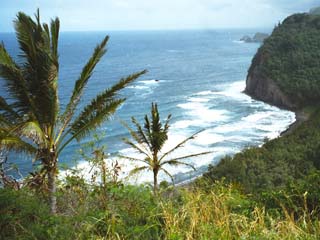
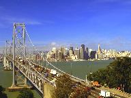