


World: r3wp
[gfx math] Graphics or geometry related math discussion
| older newer | first last |
| Tomc 8-Jan-2009 [51x2] | I made a RGB<->HSV back in the dawn of time I think newer rebols have it built in |
using HSV it is trivial to divide your start and end points into as many steps as you need | |
| Henrik 8-Jan-2009 [53] | R3 has some RGB<>HSV<>HSB code as mezzanine. Perhaps it can be backported to R2. |
| Chris 8-Jan-2009 [54x3] | 'hsv-to-rgb and 'rgb-to-hsv are in 2.7.6 |
I have a white-to-color function 'make-wash-table here. Principle would be similar, I guess... | |
http://ross-gill.com/r/arrow-style.r | |
| Anton 9-Jan-2009 [57] | Thanks guys, I know about the hsv-rgb conversion functions, and the interpolation can be improved using them, but I really wanted to improve the colours specified in the COLORS block. That means I'm looking for palettes of ~6 colours which aim to define a colour range like that of cooling metal "in the real world". But never mind, while it looks really cool to use a range of 6 colours, I'm now more of the opinion that it confuses the user interface too much - so I've now using a simple 2-colour range ! Thanks Chris for a look at your code. |
| Gabriele 10-Jan-2009 [58] | Anton, isn't the H in HSV what you wanted indeed? The actual real life colors... |
| Anton 10-Jan-2009 [59] | .. of course - Hue helps. I was sort of hoping for a palette that was maybe generated from scientific data, or an artistic eye. I was hoping to locate a website with palettes for different metals etc. Someone out there must be doing it. Just trying to locate such information is difficult because coming up with specific enough search keywords is hard in the sea of information about colour. But never mind, never mind, I can do it myself - I think it's faster :) |
| jocko 10-Jan-2009 [60] | Why not use the Matlab palettes. They are matrices of 256 colors ( RGB values), with different themes (spectrum, fire, jet, autumn, copper). You could retain only a small subset of them. |
| Anton 10-Jan-2009 [61] | Aha, that gives me a lead to follow, thanks jocko. |
| Gabriele 11-Jan-2009 [62] | My point is that "hue" is that "scientific data", that is, light wavelength. artistic eye is a different matter though. |
| Anton 11-Jan-2009 [63] | No, just grading hue by itself is not enough to qualify as "scientific data" for me :) You understand that different materials have different colours at different temperatures. As gold and steel cool down from hot white, they must pass through various colours and brightnesses before returning to their normal room temperature colours. This "cooling colour signature" varies from material to material, obviously. That's what I meant. But anyway, I'm likely to get further using my "artistic eye" than searching for such data. |
| Gabriele 12-Jan-2009 [64x2] | I'm not entirely sure about that. The emitted light wavelength depends on the temperature only on first approximation. the "room temperature color" is reflected light, which has nothing to do with the emitted light. Of course there are other variables, but I don't see them significant in this case. |
What different materials differ on would be which wavelength they absorb, while emitting. (and clearly reflection has a part in that), but for metal I'd guess that most of the light you see is coming from the surface. I don't think these things are significant enough for your purposes, but maybe they are, i'd need to check. doesn't Wikipedia have this stuff? | |
| Anton 12-Jan-2009 [66x2] | I don't know, I haven't had time to check Wikipedia thoroughly. But as we consider it more closely, we can see many factors contribute to the final colours. |
I don't think I mentioned what I wanted the colours for - a progress bar. After consideration, I've pretty much decided that a large range of colours such as cooling metal might go through might actually be bad for the user interface (unless extreme measures are taken to make it really look like molten metal, like a computer game programmer might do), because all those colours might be confusing, and some of them (eg. red) may signal warning, etc. (especially if the user hasn't seen the progress bar before - I don't want to present the user with a circus of colours). Fading from white to solid blue is what I'm using at the moment, and I'm thinking white might be too bright. | |
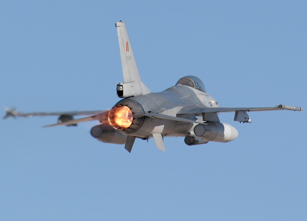
| Reichart 12-Jan-2009 [68x2] | May I suggest that: - Starting with just cold metal - metal is not a single colour. You are seeing many colours at all times, and different patches of colour everywhere. You are seeing colours reflected and you need a coefficient table to calculate the reflection index. Copper for example would lean heavily towards red. - Next, heated metals are the same, meaning, not a single colour either, but now for a different reason. But to produce the illusion of something burning hotter and hotter will require something that is multi-pass, and changing constantly. In video games to produce the afterburner on a jet we did a few tricks: - The jet flame itself was made of a cone-like shape (maybe a dozen polygons). - The cone was set with an alpha channel so that the source was close to opaque, and the tip was close to translucent. - A second cone was placed around the first cone, but just slightly larger. - They both undulated at all times. In other words, the length was always changing for both cones independently just slight. And when the jet went faster and slower, they changed from long to flat (with the plane itself). - The textures on the polygons were already a rainbox of colours, but as the jet changed what it was doing, the colour pallet was changed. Again, both cones were not always changed at the exact same time. - Just behind the jet (but depending on your angle of view), several filters (polygons that read the bg info and render again) would be used to create a small waiver and a refocusing. The more GPU you had, the more of this you could do, and the better the final effect would look. - Lastly, and this is what makes the whole thing amazing in a 3D game. We are always checking the location of bright things, such as the sun, or things like the after burner filling your screen. If so, we change the contrast of the whole world, and flare out your iris. In the case of the sun we throw up a lens flare, and darken all the ships in the sky. Even as a 2D problem, you should attach this the same way. This video I think drives this all home for you. http://www.youtube.com/watch?v=mHL94qQgl_8&feature=related |
This photo drives this point perfectly http://www.richard-seaman.com/Aircraft/AirShows/Nellis2006/Extras/BelgianF16Afterburner.jpg See how the jets are making the left wing blurry...this is what makes it look hot more than even seeing the jet itself. That just tells you the source, not that it is so hot it messes up the air. | |
| Maxim 12-Jan-2009 [70x4] | also don't forget that light is additive, so sometimes, all you need to do, in visual effects, is add up an immense number of very dark particles. where they are tightly packed, it will create a ball of white, by iteself. |
the different hues, will build themselves up based on the falloff your particles are spreading out at. | |
the same probably applies wrt the way the color spreads out over the time it cools down and/or the distance from a single hot point. | |
if your base color is some kind of darkish brown, it will glow from brown to orange to yellow to white. the bluish tint usually comes from the surface which "blues" because its exposed to heat. not all metals "blue". some melt before getting that hot. | |
| Anton 13-Jan-2009 [74x3] | Wow - you guys. This is very interesting, but, going too far for my purpose at the moment. I *really* like the idea of having the simplest, most robust code possible. Adding so many visual effects and detail is something for a computer game. |
I'm mostly concerned with communicating as simply and directly as possible to the user the current overall progress of some operation (multiple file download is first application). | |
(I appreciate all the technical details very much, however.) | |
| Oldes 13-Jan-2009 [77] | This site is good for color picks http://www.colourlovers.com/ |
| Henrik 13-Jan-2009 [78] | nice one, Oldes. |
| Robert 13-Jan-2009 [79] | Yes, cool. |
| Brock 13-Jan-2009 [80] | Interesting stats in the lower right corner of the page... About Colourlovers. An idea of what we could have for the AltME stats on Rebol.org as suggested in another group. |
| Anton 14-Jan-2009 [81] | *That*'s the kind of website I was after, thanks Oldes. |
| Maxim 28-Jan-2010 [82] | anyone know if/where I can find an implemented shortest path algorythm in rebol? I know I can do my own... but if one exists and available, I'd rather use it :-) |
| Cyphre 29-Jan-2010 [83] | Maxim, do http://cyphre.mysteria.cz/a-star.r that is my very old script I used for prototyping when developing strategy games couple of years ago. It's not optimized as it is just prototype before conversion to Java but it kinda works ;) |
| Gabriele 23-Feb-2010 [84] | http://www.4p8.com/eric.brasseur/gamma.html |
| Gregg 23-Feb-2010 [85] | Thanks for posting that Gabriele. I had no idea. |
| Geomol 24-Feb-2010 [86x3] | Yes, quite interesting. Never heard of that. |
REBOL produce a green result here, when scaling the test image to half size. view layout [image http://www.4p8.com/eric.brasseur/gamma_dalai_lama_gray.jpg image http: //www.4p8.com/eric.brasseur/gamma_dalai_lama_gray.jpg 129x111] | |
DRAW produces a gray result: i: load-image http://www.4p8.com/eric.brasseur/gamma_dalai_lama_gray.jpg view layout [box 200x200 effect [draw [scale 0.5 0.5 image i]]] | |
| Henrik 24-Feb-2010 [89] | Downscaling in View and DRAW that way basically work the same (pure nearest neighbor), but it might be that View is sampling odd rows and DRAW is sampling even rows. |
| Geomol 24-Feb-2010 [90] | My view test was in R2. |
| Maxim 24-Feb-2010 [91x6] | the gamma issue is a standard "senior artist" debunking test for high-end effects artists hehe tell the (often ego-filled, highly paid) artist to a simple pan a starlit field (a simple sky shot at night). he will LAUGH and tell you that's its an easy thing to do... and then watch him struggle with the results, if he doesn't know his theory. what happens is that as a pixel is distributed across several pixels, it will dim. as the pixel gets closer and closer to a 1:1 position with another pixel it will pop right back. you must pre-amplify the "energy" of the light before panning, and then bring it back down... which, depending on the image & screen will usually be a value between 1.7 to 2.2. |
the final result, when facing a "junior" compositor is that the stars blink in and out of existence as the image moves... You get this blunder even in High-budget effect-heavy movies coming out of hollywood. | |
the same problem is the basis for poor font aliasing. | |
AGG has an issue on every aliased stroke, btw.... just look at a red circle on blue bg and then a blue bg on red, and you will see there is a 1-2 line offset in the circle. There is no way to fix this in R2 AGG and I think that part of the problem is based on similar gamma assumptions. also RGB pixels will affect left/right edge too, which is probably just amplifying the problem. | |
oops above should read: "and then a blue circle on red bg" | |
another thing that people do not often realize is that our eyes are also not linear... you can see each 8 bit step in the dark areas of an image, but can skip 5 steps within the brighter areas of an image without noticing it. which is why we always notice image compression in very dark parts of DVDs and not in the bright parts of it... its very surprising to me that many compression algorythms get this wrong straight out of the bat. | |
| Gregg 24-Feb-2010 [97] | Well, there isn't any excuse for us to get it wrong in R3 now. :-) |
| Cyphre 24-Feb-2010 [98] | Max, I tried to compare the circles example as you described and I don't see any offset here. Can you clarify? Also you can set the gamma correction for AGG antialiasing in R2. But yes, it looks the AGG filters(which are separated from the AA code) have the same gamma issue as described in the article. I believe we can fix that (hope it won't slow down things). |
| AdrianS 24-Feb-2010 [99] | Is the situation wrt the range of intensity really as described in the article? I seem to recall that the receptors for the three colors in the retina are not all equal in terms of sensitivity. In particular, the eye is supposedly more sensitive to green. Why the assumption that the three colors should have the same exponential scale? |
| Maxim 25-Feb-2010 [100] | the scale is the same, because its a question of energy distribution vs color distribution, but our green sensitivity is about 4 times higher than red or blue. |
| older newer | first last |