


World: r3wp
[!RebGUI] A lightweight alternative to VID
| older newer | first last |
| Reichart 1-Jan-2008 [7303x2] | Vertical tabs - What are anyone's thoughts on vertical tabs? They look cool, and I can see their use, but they strike me as...well...annoying, similar to my issue with Rotary (spinner). Rotating or obscuring information just seems not worth it. Here is an image of vertical tabs http://en.wikipedia.org/wiki/Image:Vertical_tabs_sample.png Coloured tabs - As to colouring tabs, interesting. I'm a big opponent of colours generally. One of the most common requests we get on our Calendar is to be able to colour meetings. We ARE indeed going to allow this, but I think it is better to keep things neutral. On the Mac, meetings are "categorized" into things like Work and Personal, each of which are given colour. This works well in "personal calendar systems", but this breaks down very quickly when working in a "collaborative calendar system". Who gets to decide the colour of something? What is "something"? As in, is it by project, by who is in it? By what it is (a meeting, a flight, a memo, a call, or other things people can put on a calendar now). All very tricky. |
Whe nI say Mac, I'm speaking of iCal. An applicaiton on the Mac. Which is very nice looking, but breaks down with REAL use. | |
| Geomol 2-Jan-2008 [7305x2] | My points of view is founded in usability, so Vertical tabs: They're not good, when the text is rotated, because it requres too much to read it then. Vertical tabs are good in a telephone book e.g., where each tab only has one letter: A, B, C, etc. Colours: I like colours, when it doesn't look like a painters palette. Done right, colours are very good to give info, so you don't have to read the text to understand. |
Jakob Nielsen does write many interesting things, like this about web functionality, he wrote in 2000: http://www.useit.com/alertbox/20000625.html Read it in general (and not so much about .NET, that's just one technology). It takes time to move the technology and people's behaviour, but I think, he has many valid points. | |
| Reichart 2-Jan-2008 [7307] | I wonder if even ABC is too hard on the eyes. Perhaps that is the limit (one letter or number). |
| Graham 2-Jan-2008 [7308] | set-values seems to require a 'show after this to update the display. |
| Ashley 2-Jan-2008 [7309] | I'll add a show to it, along with a no-show refinement, next build. |
| Rod 2-Jan-2008 [7310] | My first impression on the tabs is I would prefer the color effects of unselected and mouse over to be reversed. It seems backwards to have it go from the bold green to the faint green when you mouse over. |
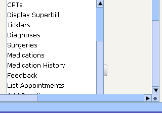
| Graham 3-Jan-2008 [7311x2] | I've got some drop down lists that are inside a scroll panel, but the bottom of the drop list goes beyond the bottom of the scroll panel. this means that I can not see the bottom of the list and because there's no keyboard navigation of the drop list, I can't choose the bottom choices. |
http://synapse-images.s3.amazonaws.com/drop-list-display-problem.png | |
| Graham 4-Jan-2008 [7313x3] | Got this on clicking on the tree
make object! [
code: 312
type: 'script
id: 'cannot-use
arg1: 'path
arg2: 'none!
arg3: none
near: [pane/1/offset/y: pos
pos: pos +
]
where: 'show-node
|
Nothing appeared in rebgui.log | |
I hope it's not because I've been adding to the tree/data ....! | |
| Ashley 4-Jan-2008 [7316] | That would be it. Unlike other list widgets, which use a face iterator to only display visible faces, tree takes a brute-force approach and pre-builds the entire tree based on face/data. At runtime it uses face/data to work out where to position faces. |
| Reichart 7-Jan-2008 [7317] | Can you point me to some screen shots of the newest RebGUI, perhaps a few examples from some applications using it? Anyone... Also, I will be finishing those logo examples today. |
| Graham 7-Jan-2008 [7318] | I'm not sure if the latest is intended to be the latest as it were. A large number of graphic changes were made. |
| Ashley 7-Jan-2008 [7319] | Correct, the look and feel is a work in progress at the moment. screen shots of the newest RebGUI ... I've created a snapshot release here: http://www.dobeash.com/RebGUI/rebgui112.zip Just unzip and run %tour.r and %RebDOC.r to get a feel for where things are at. |
| BrianH 7-Jan-2008 [7320] | How's your resize support? The tour and RebDOC were too big for my screen resolution (1024x768) and the windows weren't resizable. |
| Ashley 7-Jan-2008 [7321] | Resize works, but only %tour.r uses it at present. If resizing is enabled then the *minimum* screen size is set to starting screen size unless explicitly set via a refinement. Problem in this case is %tour.r has "grown" to 696x785 and %RebDOC.r is 800x829 (and I've not used 1024x768 for a couple of years now). I'll fix this for the next build though. |
| Graham 7-Jan-2008 [7322] | Isn't Brian saying that the windows were too big for his 1024x768 ?? |
| Reichart 7-Jan-2008 [7323] | Ashley, Very cool... After Dinner will make you a small log LOL clearly you need it. |
| amacleod 8-Jan-2008 [7324] | Having trouble with the #HWLVXY codes. I have two group-boxes next to each other. When I resize the window They overlap. I want them both to expand in size "H" and "W" but not overlap. Is this possible? |
| Ashley 8-Jan-2008 [7325] | No. You can however have this: display "Test" [ group-box "A" #HW data [field] group-box "B" #HX data [field] ] The resizing model is *very* basic and only supports one widget in a row / column resizing horizontally / vertically. |
| Reichart 8-Jan-2008 [7326] | Ok, here are some other examples, and considerations when sized. For example, when you get small, the "hand" looks like the REAL hand on the screen, which could confuse people. So while it is fun at larger sized, it won't work once the pixels drop to less than 4x4 each (my guess). I think you might like the one in the lower right. It is very RACEY, the italics make it look "fast" and the black and red were something I think you requested. If you want me to try something special, or do a treatment like something else you have seen out there, just say the word. This one is a Qtask syndicated Folder. So any file we put in this folder from inside Qtask can be accessed by people outside of Qtask http://www.qtask.com/files.cgi?tab=sFolderList&uuid=YG82XF3CFW8AQ6W5NYTXV9NKE3QT So for example, since this came from the "REBOL SIG" project inside Qtask, Ashley, you can go into that project, and delete this file, which will effectively put it in the Trashcan, and this link will then point to an empty folder for people. |
| Robert 12-Jan-2008 [7327x3] | Ashley, please bear in mind that laptop screens these days are: 1280 x 800. I can resize RebDoc, Tour because it's to high. |
BTW: RebDOC is very nice. | |
Looks that I have to backport a lot of stuff to a new RebGUI. | |
| Graham 12-Jan-2008 [7330] | Ashley, did you note my problem with drop down lists in a scroll panel?s |
| Ashley 12-Jan-2008 [7331] | I did. Correct me if I'm wrong but it's only a problem in scroll-panel's that can scroll vertically? Is there a real (as opposed to theoretical) usage case where you'd need a drop-list in a vertical scrolling panel? |
| Graham 12-Jan-2008 [7332] | the screenshot is from my real application :( |
| Graham 13-Jan-2008 [7333] | Just had a look at the source again ... as the droplist-mode for drop-list gone? We used to have the option of setting 'auto, 'middle, 'upward and 'dowward |
| Ashley 13-Jan-2008 [7334] | Defaults to auto now, and has for some time. |
| Graham 13-Jan-2008 [7335x2] | So, we can no longer change this? |
IOT, auto doesn't work for me .. my drop lists disappear at the bottom of the window losing data. | |
| Ashley 13-Jan-2008 [7337] | Please post a small test case that demonstrates this. Thanks. |
| Graham 14-Jan-2008 [7338x5] | Looks like my problem was that I had nested tab-panels,and the inner one with the drop list was deeper r than the outer one. |
and the outer tab-list cut off the bottom of the drop list. | |
tab-panel | |
Temporarily solved the drop-list problem in a scroll panel by just doubling the data in the list ... | |
So it no longer matters if I can't see the bottom. | |
| Graham 18-Jan-2008 [7343] | Just wondering how hard it would be to do a predictive text like widget |
| Ashley 18-Jan-2008 [7344x2] | I couldn't predict that ;) What exactly is it? |
auto-complete? | |
| Graham 18-Jan-2008 [7346x4] | I was thinking of cellphones that use predictive text to guess what you're trying to write. if the word isn't correct, you hit a special key and it cycles thru all the choices for you changing the current word in-situ. |
Now predictive text is trickier cause each key has 3 choices of letters whereas a full keyboard there is no doubt about the letters you are typing. | |
so, perhaps more interested in the cycling .... | |
the idea is to greatly speed up text entry at the keyboard | |
| PeterWood 18-Jan-2008 [7350] | OpenOffice does predictive text on the basis of words you've previously typed. It seems cool until you use something like manager, managed, managing and management in it. It then quickly becomes annoying and slows text entry down. |
| Graham 18-Jan-2008 [7351] | how so .. you type man and get 5 choices so save on typing all the rest ... |
| PeterWood 18-Jan-2008 [7352] | With Open Office you type man and get management whether you like it or not? |
| older newer | first last |